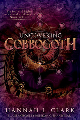
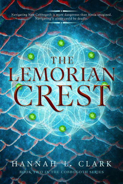
It's a cover reveal kind of week this week, so today I'm bringing you (forcing on you?) another cover I've had the pleasure of working on recently. The process of designing the cover for a sequel without having worked on the first book is always a fun challenge for me, the goal to make it stand on its own while still incorporating recognizable elements of the first cover to ensure they have a similar feel.
Uncovering Cobbogoth is the first book in Hannah L. Clark's young adult fantasy series and the foundation off which I needed to base The Lemorian Crest. Both Hannah and I loved the star graphic with the jewels behind the title, so we wanted to make sure the new design had a similar line art element as a focal point. We also wanted to simplify, playing up color and texture as is highlighted on Uncovering Cobbogoth while allowing the title and background graphics to be a bit more easily decipherable. I hope you guys like what we've done with The Lemorian Crest!
After being raised from infancy in Boston, Mass., Noria (a.k.a Norah Lukens) has no idea what to expect upon entering New Cobbogoth, where she never would have guessed that paths of light can make you vanish; doors can lead to realms both near and far; myths and legends are actual history; a mere kiss can seal two souls as one; and, of course, a stone is never “just a stone.” Her Uncle Jack’s stories never could have prepared her for the magical and dangerous place her native realm is turning out to be.
When the Gihara’s promises begin to crumble, her best friend and soul-mate Jamus (a.k.a. James Riley) is in more danger than ever. Then when his father Lylend abandons her to search for an ancient relic called The Lemorian Crest and she is taken captive by the very people she’s risked everything to save, Noria begins to lose faith in the Cobbogothian gods and the mission they sent her home to accomplish.
Only when a series of new friendships and loyalties are forged in the most peculiar of places, does Noria dare hope again. Hope for Jamus’ safety, for their future together, and for the survival of the entire Cobbogothian race.
Find Hannah:
You can find more of my cover design work at Seedlings Design Studio!


wow both are really beautiful. The new one is intriguing, the stairs make me want to know more.
ReplyDeleteLooks cool :)
ReplyDeleteIt's gorgeous, Jenny!
ReplyDeleteBeautiful Jenny. I love that it looks like it is lighted
ReplyDeleteBeautiful as always, Jenny! I especially love the colors in the 2nd one! :)
ReplyDeleteYou did such a great job, Jenny! The first one was gorgeous and you managed to work on a cover that has its own personality but matches so well! Love the colours you used!!
ReplyDeleteGorgeous, Jenny! I love how you matched the previous novel, yet this one's really pops with the title. I also love the texture, it almost reminds me of dragon, or even exotic fish scales!
ReplyDeleteHave a wonderful weekend :)
I think you did an absolutely amazing job doing everything you set out to do Jenny, it looks gorgeous!
ReplyDeleteWell done! Have a wonderful weekend and thanks so much for sharing your talent with us!!
I agree with all of the above, Jenny! TLC's cover is absolutely beautiful and exactly what I was looking for. Thank you for hosting it on your blog today. ;-)
ReplyDeleteSo beautiful! As aways, I'm awestruck by your imagination and skill :)
ReplyDeleteLOVE this! Oh that background really has me wanting the book. LOVE the scales. Beautiful work!
ReplyDeleteWow- that's awesome! Love the font and the background. Well done, Jenny. I can't wait to see what you come up with next! Have a great weekend!
ReplyDeleteThey're so gorgeous!
ReplyDeleteThis cover is so pretty, not surprised at all you designed it!
ReplyDeleteHoly crap that is gorgeous!! I mean, I absolutely love the first book cover too, but the sequel cover that you did - WOW!!
ReplyDeleteGosh these covers are positively gorgeous!! The story sounds interesting as well Jenny!
ReplyDeleteNicely done, lady! I really like that you kept the star graphic. The covers are so colorful too!
ReplyDeleteAhh these are AMAZING. <33 You are seriously so talented.
ReplyDeleteThe first book has a lot going on in the cover, and so while it's pretty it's doesn't make as much of an impression and the 2nd book. I think The Lemorian Crest stands out more and I like the bold letting more. You have such an eye, Jenny! I remember that post you did on Heidi's blog where you pointed out exactly what wasn't working with some of the covers. With me I can say, 'Oh, I like this one, but that other one, not so much' and yet I can't always pinpoint what doesn't work. I love your cover posts! :)
ReplyDelete*as not and. It's late and I'm tired, can you tell by my rambling? Sorry, lol! :)
ReplyDeleteYou did a great job Jenny! It's different while still looking like part of a series.
ReplyDeleteKaren @For What It's Worth
Seriously, girl. You are cranking this sh*t out!!! And it's awesome! As always, I'm blown away by your talent. :)
ReplyDelete