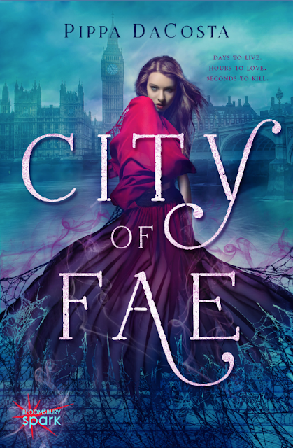
I'm hugely excited and honored today to be a part of the blog tour for Pippa DaCosta's paranormal new adult novel, City of Fae. As many of you already know, I had the pleasure of working with both Pippa and Meredith of Bloomsbury Spark on this cover, so I thought it might be fun to do a little something different for my tour stop and give you guys a behind-the-scenes look at how this cover evolved over the course of the design process.
This was the original raw image. What first struck me about it was the old-world feel to the background city and pavement, and the very eerie quality to the mist as it swirled around the bold girl in red. I instantly pictured this image with London behind her as she stood strong against whatever paranormal creepiness might be hiding in the fog.
The initial critique of this image, while positive overall, raised questions about the model's facial expression. Her downcast eyes seemed too passive for Alina, so my first order of business involved finding a fiercer face for our heroine. Luckily for me, there were a series of shots of this same model available, so with a few small tweaks to color, I was able to give her a new look with relative ease.
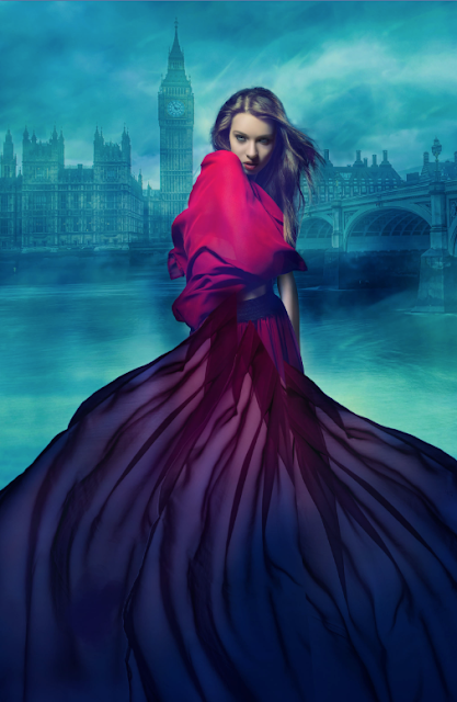
After adding London to the background and making some color adjustments to help the cover pop, I ended up with this:
As you can see, I also made a small tweak to the garment wrapping around her shoulders, bringing the fabric in a little closer to her body on the left so as to add a special effect with a spiderweb later. The concept for this cover involved a disintegration effect, with Alina's body gradually dissolving into spiderwebs (to find out why that fits this story so well, you'll just have to read! ;-). I knew in order to achieve this effect, I had to build Alina's dress up and out, adding volume first so I could then subtract in places once I had more material to work with:
This is a very rough approximation of the final gown, you can see the new sections of fabric aren't quite blended into the original dress as of yet. In addition to building the bottom of her gown, I also had to create a large chunk of pavement to cover Alina's feet, otherwise the bottom hem of her original skirt would have been visible through the web.
The dress/web disintegration effect was done with a series of masks in Photoshop, adding pieces of the web in some areas and essentially deleting sections of web from the dress in others. This was a tedious process with a great deal of trial and error, and though I emerged from this round of proofs temporarily blinded from staring at my screen for so long, I think the final effect was worth it!
At this point the design was nearly finished, with only a few small tweaks remaining. I added some colored smoke and a slight purple glow around her body to give the cover a more ominous and paranormal feel:
The final steps included adding the small web detail on her shoulder where I'd removed the fabric before and incorporating the type. I knew I wanted a typeface that was elegant and sophisticated, befitting the regal quality of her dress, but I also knew the tunnels underneath the city played a role in the story, so I wanted to make sure the type had a grittiness to it as well. I made a few small adjustments to the letter shapes themselves and worked in a subtle texture, and then with the addition of the Bloomsbury Spark logo, a few extra smoke trails weaving around the title, and Pippa's name, we had our final cover!
CITY OF FAE
From the moment Alina touches London's hottest fae superstar, breaking one of the laws founded to protect all of her kind, her fate – and the fae – close in.
Below ground, the fae High Queen plots to claim the city as her own and places her pawns, ready for the battle to come. A battle she cannot lose, but for one small problem – Alina. There are four ancient keepers powerful enough to keep the queen in her prison. Three are dead. One remains … And to fight back, Alina risks sacrificing everything she has come to love.
This New Adult urban fantasy is packed with action and suspense and will have you yearning for more forbidden fae romance.
Find Pippa:
Be sure and check out the previous stops on the tour for more interviews, guest posts and City of Fae awesomeness!
- Monday 11th May – ANZ, Jeann, http://www.happyindulgencebooks.com
- Tuesday 12th May – ANZ, Chelsea, www.booknerdigans.com
- Wednesday 13th May – UK, Jenny Davies, Wondrous Reads
- Thursday 14th May – UK Katie Halliday, KitKats Can Read
- Monday 18th May – US, Sarah http://allthingsuf.com/
- Tuesday 19th May – US, Jenny http://supernaturalsnark.blogspot.com/


It's impressive to see al the changes. I'm currently reading it. This cover is just so stunning.
ReplyDeleteI just love seeing how a gorgeous cover like this came to be. Being a known cover snob, I know I'll be picking this up based on looks alone. It's just so gorgeous, Jenny! But I never doubted you for a milisecond. Also, I'm curious about those darn spiderwebs.
ReplyDeleteI was all so far it looks good and then..then there was more, duh . LOL
ReplyDeleteI love seeing a cover evolve, and this one is absolutely gorgeous! I love the colors and the effects and the title, it's so bold and eye-catching. Thanks for sharing this behind the scenes look at the cover process - what a gorgeous finished product!
ReplyDeleteIt's so cool to see your process, Jenny! Another stunning cover. :)
ReplyDeleteI love seeing your creative work process, Jenny! I hope you keep sharing these types of post because they are so fascinating. It must be an amazing feeling to have your gorgeous covers grace these books :)
ReplyDeleteWOW, Jenny! That looks like so much work went into the creation of this gorgeous cover. You're just so talented! I love that you shared with us all the details that went into making this cover.
ReplyDeleteThis was fabulous!
This is so interesting, and I love seeing how the final image looks similar to & different from the original. Your covers always look amazing, Jenny!
ReplyDeleteFabulous!! I loved this post, Jenny. :) You're a genius. I love the eerie feel of the original cover as well, but the changes you made were spot on. The webs must've taken forever--if I were to try that, I would fail terribly. The purple smoke = LOVE. And the typeface is absolutely stunning. <3
ReplyDeleteLOVED! This is one of my most favorite covers you have done Jenny and I want to buy a hardcopy of this book just because of the cover!! Beautiful work!!
ReplyDeleteThank you for sharing the intricate process of cover design. It is amazing and one on my favorite covers. Beautifully done Jenny
ReplyDeleteI ADORE this post Jenny^^ I could easily read stuff like this for EVERY cover design you do and never get bored! You're brilliant, I love the changes you brought to the image step by step and how you totally made it work with the book's content. I NEED this book in my life :D
ReplyDeleteLove, Love, LOVE! Thank you so much for sharing! This is one my favorite type of posts, learning about the cover design process. And this cover is STUNNING. I would pick this book up based on the cover alone!
ReplyDeleteOh, my goodness... I'm speechless. You're unbelievably talented!
ReplyDeleteThat was stunning to see....thank you for sharing it Jenny. I would really like to read this one.
ReplyDeleteThat was stunning to see....thank you for sharing it Jenny. I would really like to read this one.
ReplyDeleteI love this kinda posts about how the covers come to be, and even more when they come from you, because you explain the whole process so well!
ReplyDeleteBrilliant job as usual Jenny!
WOW, such a fun post! I love how this all came together and would love to see more posts like this.
ReplyDeleteGreat choice with the face, and the background is fantastic, too. You are so versatile, Jenny. I love that you can go dark or whimsy. That's how you keep your work fresh.
ReplyDeleteWOW! It's so cool to see how you got to the final design! It looks like WAY more work than I originally thought. Incredible! You are so talented. I loved this glimpse into some of your work....I hope to see more in the future!
ReplyDeleteI was wondering about your process -- thanks for the peek behind the scenes! I love that initial image and can see how it caught your attention for this book.
ReplyDeleteLoved this post, Jenny! I had no idea all the work and thought process that goes into book covers. I love the additions of the spider webs, particularly of the dress and the paranormal flare to the edges. Very cool!
ReplyDeleteThis is a fascinating process, Jenny! You made the cover look phenomenal! Gorgeous!! :)
ReplyDeleteWonderful post, Jenny! It was very interesting to see the work behind the scene. Gorgeous cover!
ReplyDeleteThat was fascinating. It's like watching magic happen! Gorgeous cover!
ReplyDelete