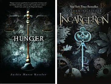
Let me preface this post by saying that my design critiques of these covers are in no way, shape or form a reflection on the author, the content or the publisher. I know the authors have very little, if any, control over the design. These are strictly my thoughts stemming from my design experience.
Hmmmm. Anyone else seeing double? Both covers are gorgeous, I just find it interesting how similar they are despite the different publishers and therefore presumably different design teams. As it is, I've concocted a fictional conversation between the respective designers during the design process:
Incarceron Designer (to be abbreviated ID): Hey
Hunger Designer (to be abbreviated HD): 'Sup (we designers are very hip and cool)
ID: How's your cover design going?
HD: Good. It's almost done, I'm liking what I have so far. I've gone with an eerie blue-gray and black color scheme that I think represents Famine well. I've also played around with a heavily textured background and vignetted the corners so there is a gradient effect from the image to solid black. You're jealous of my design skills right?
ID: Um. I've done a blue-gray and black color scheme, textured my background and vignetted my corners to black as well. So I'm apparently not jealous, but of the same mind.
HD: What! Send me your file.
ID: Send me your file!
They email each other the files.
HD: Maybe no one will notice?
ID: ...
HD: Right. We'll just tell everyone great minds think alike.
ID: At least my type treatment is better than yours. I've got an interesting, eye catching font. See how my serifs extend above and below some of the letters? And how my size and height alternate letter to letter? It's ingenious. Visually engaging. You have a boring, linear serif font.
HD: Real mature. My author's name is more readable because it pops off the black. And I have a quote. What say you to that?
ID: I say you pilfered my design that's what.
HD: I pilfered? You were clearly influenced by me. You even took my nature theme. I put branches in my background and then you try to one-up me with your leaves.
ID: I added gears and clock faces, so that's something. But you know what?
HD: What?
ID: My book releases before yours. I win.
HD: Crap.

LOL! They do look incredibly alike though.
ReplyDeleteThey really do look alike!Never thought so though before seeing them together.
ReplyDeleteLOL It's all about the release date :oP
ReplyDeleteI'm in agreement with Anna. I've seen the two covers but never really noticed the similarities until they were side-by-side.
Oh...and thanks for becoming a new follower :o)
XD! You're right, they do look alike! I never would've caught that-thanks for pointing it out o.o Oh, those cover designers....
ReplyDeleteSo funny! I noticed the same thing too when I saw the cover design for Hunger. It doesn't make me want to read it any less though!
ReplyDeletethat is too too funny.....are those US covers? btw, I cannot WAIT for Mockingjay too!!!
ReplyDeleteLOL! These type of posts are why I adore you!
ReplyDeleteP.S. ID's font is WAY cooler! Sorry HD!
LMAO!! I literally laughed out loud at this post =D Fantastic!!!
ReplyDeleteI thought the same thing when I saw the cover for Hunger. For about 15 seconds I thought they were related because, well, duh - look at them! It's like they called each other...haha.
AWESOME post :)
♥Isalys
Whoa! Twins!
ReplyDeleteOh that is hilarious!! love it!
ReplyDeleteLOL Funny
ReplyDeleteHave you noticed the same font on Beautiful Creatures and Delirium?
ReplyDeleteI love both covers but you're right about the uncanny similarity! And you're conversation was brilliant and made me giggle right out loud. Thanks for that :D
ReplyDeleteAnd also, thanks for following my blog. I love your blog and plan on stopping by often. Have a great day!
Thanks for the comments everyone! I wasn't sure if anyone would like my fictional conversation format, but it seems you do so I'll keep it up:)
ReplyDeletenow that I look at it, yeah they do look similar! thanks for that, that was such a hilarious conversation!
ReplyDeleteby the way, I am passing the Versatile Blogger Award to you, because you have such a great site! I'm off to look at it some more, I really like your design!
http://amaterasureads.blogspot.com/2010/08/versatile-blogger-award.html
I hope you're having a great weekend!
Just glancing at those covers and not paying attention to the authors, I totally thought they were in the same series. Hmmmm....
ReplyDeleteCongratulations! You’ve just been awarded the veratile blogger award from The Cupcake Queen Book Reviews!
ReplyDeletehttp://cupcakequeenbookreviews.blogspot.com/2010/08/cupcake-queens-first-blogger-award.html
This is marvelous! I have seen so many similar covers and it does make you wonder :D
ReplyDeleteYour fictional conversation was hilarious. :)
ReplyDeleteJane
janestoryblog.blogspot.com
lol true story. It's why ID decided to add bigass flowers to his bg. Now they're different, OKAY?
ReplyDeleteAlso, I've been digging through posts trying to find a book we have reviewed in common so I can say something relevant, but so far zilch D: But I see your a Mercy fan, which means I have to pimp our Mercy Thompson series review. That is all.
Great blog. Snark is always welcome.