Showing posts with label Book Cover Design. Show all posts

Wednesday, October 12, 2016

Wednesday Flourish: Halloween Frost

Hey Everyone!

It's been a little while since I've done a flourish post, and today I have a project to share that makes me shake my head in wondrous disbelief every time I look at it. I started this blog nearly 7 years ago, and just before I did so I discovered a little series by a new-to-me author thanks to a blogger recommendation. That "little" series was the Elemental Assassin series by Jennifer Estep, one I fell immediately in love with and that has held me captivated through sixteen books and seven years. After finishing the first book Jennifer became an auto-buy author for me, and I devoured everything she wrote as soon as it released, including her YA urban fantasy Mythos Academy series.

Why am I telling you all this in a flourish post you ask? Well, I'll tell you. I had the completely surreal experience of being asked recently to design the cover for Halloween Frost, a Mythos Academy short story. *falls down dead* After I picked my jaw up off the floor and pulled myself together into some semblance of professionalism, I jumped on the project and Jennifer and I began working.

I always start my projects with idea boards – a multi-page PDF that groups together existing covers as well as stock imagery/illustrations and font suggestions into various design concepts – so that I can get a better feel for what my clients are looking for before I move forward with comps. It's basically an outline stage for the design work, and prevents me from going in one direction while my clients are picturing another.

After submitting the initial boards, Jennifer and I both knew we wanted to move forward with an illustrated cover (YES!) that created an entirely new brand for the Mythos books. Given this short story is Halloween-themed, we started by focusing on that element, working pumpkins, bats, spiderwebs and a black panther-type creature called a Nemean Prowler in and around the title.

While the first comps were cute, the general consensus was that they were almost too cute, and read younger than we wanted them to. We thought it was likely the classic Halloween elements that were giving us the more middle grade feel, so we abandoned that concept entirely and decided to focus on just the town and the prowler.

Jennifer was taken with the first of the revised comps, but there was a concern that emphasizing the paranormal creature might be tricky from a series perspective as the creatures in future books venture into lesser known mythological beasts, and thus might make them harder to find in stock illustrations. (I'm not an illustrator, so I always start with a stock illustration as a base, and the build from there to create something new.) We ended up keeping a few of the main design elements from that comp, but eliminated the prowler and played up the town's clock tower instead, while also making a few adjustments to the overall color scheme.

While we both liked the new color scheme and the changes to the clock tower, the cover just didn't have the same impact and sense of danger as it did with the prowler, so we retraced our steps and went back to the prowler design, taking the new color scheme, font, and clock tower changes with us. The final cover is one I'm infinitely proud of and so honored to have worked on, and I hope you guys love it as much as Jennifer and I do!

HALLOWEEN FROST (Mythos Academy #1.5)
(available now!)


It’s Halloween at Mythos Academy, and Gwen Frost and her friends are ready to have a little fun. But when a mythological monster shows up, the night turns out to be more trick than treat.
Halloween Frost takes place in between the events of Touch of Frost, book #1, and Kiss of Frost, book #2, in the Mythos Academy young adult urban fantasy series. The short story is about 6,500 words.
Halloween Frost was originally published in Entangled, A Paranormal Anthology, in 2011.


Find Jennifer:

Friday, July 15, 2016

Friday Flourish: Concealed + Exposed

Happy Friday Everyone!

It's disgustingly hot here (if it's under 93 degrees where you live, let me know where that is so I can move immediately. If it's over 93, let me know where you are too so I can avoid it ;-)), so I have an indoor kind of weekend ahead of me. *basks in the air conditioning*

One of my recent projects was a young adult post-apocalyptic series, a genre that had me really excited because I haven't done many covers in the way of post-apocalyptic or dystopian designs, and you guys know how much I love a new kind of challenge. When I know a book is going to be a part of a series, my overall design process takes a different path than with standalone covers as I need to make sure what I create for the first book has adaptability and branding potential moving forward. I want to make sure each book in the series fits with one another while still making a strong statement on its own, so with the Virus series author RJ Crayton and I spent quality time in the planning process figuring out just how we would connect each book visually.

RJ new she wanted a more symbol-focused design, a strong focal point in the middle that would stay the same book to book while the color scheme and textures would change to reflect each individual story. Given Concealed and Exposed both dealt with a viral outbreak and its aftermath, the biohazard symbol seemed like the perfect fit – a bold warning to catch the eye and hopefully intrigue enough to make readers want to know more.

I wanted to share both covers today so you could see how they worked together as a pair, and stay tuned for book three, Contained, in the coming months! I hope you guys love how they turned out:)

They said it was extremely hard to get.
They said it wasn’t airborne.
They said there was nothing to fear.
They were wrong.

Seventeen-year-old Elaan Woodson was supposed to be one of the lucky ones. She got one of the few spots in the subterranean protection unit designed to keep select scientists, military officials and their families safe from the deadly virus ravaging the world above.
But, how lucky are you really when the people in charge and those you love keep secrets from you? 

While Elaan has heard that what you don’t know can’t hurt you, she’s beginning to think otherwise. And she should…

GoodreadsAmazon


The safety of the underground bunker is left behind. Elaan and her friends are out in the open, exposed to the world above. Exposed to a world that has been ravished by the virus. Can they make it to the one person they've been told can provide them safety?


Find RJ:


You can check out more of my design work at Seedlings Design Studio  

Friday, June 24, 2016

Friday Flourish: I'll Be Yours

Happy Friday Everyone!

I hope you guys are all having a great summer so far! Mine is flying by, I can't believe it's almost July already. Since the official first day of summer was this week, I thought I'd share a recent cover design that's perfect for your summer reading lists (even if technically football takes place in the fall ;-))!

As much as I love illustrated covers and effects-heavy designs for all that they teach me new and fun things in Photoshop, it's equally rewarding to work on projects that are a little more straightforward visually and focus on the simple gorgeousness of color, type or photography. Author Jenny B. Jones got in touch with me for one of her recent releases, a sports-themed contemporary YA romance, and I had an absolute blast bringing I'll Be Yours to life on the cover!

While I of course wanted this cover to feel like it fit with the genre, I also wanted to make it as unique as possible, incorporating the football element in a more subtle way. For the main image we focused on a specific lakeside scene from the book, but I knew I needed to bring the football element in as well since it played such a pivotal role. I could have gone with a university-style font consisting of large block letters that scream sports, but since that's been done and done well on a number of covers, I wanted to take us in a slightly different direction. I found a big, bold and rounded font with tons of personality that I knew I needed in my life immediately, and once I saw it in place, how to introduce the football element finally clicked for me. Since both football plays and romance can be expressed with x's and o's, I thought it would be cute to bounce them in and around the type, making the title treatment a strong visual statement against the colorful sunset sky.

I absolutely love how this one turned out, so I hope you guys do too! Plus, any cover with a dog on it is an automatic winner to me:)


She’s the coach’s brilliant daughter, clueless about love. He’s the dethroned football star, ready to teach Romance 101. When dark secrets and sparks collide, there’s no playbook for what happens next.

The day Andrew Levin arrives at Washington High, Harper O’Malley knows he’ll make the perfect starter boyfriend. The school’s newest band geek is totally in Harper’s league, yet completely out of this late-bloomer’s reach. Between fitting in with a new family, scoring the first chair in band, and rescuing dogs for the local animal shelter, Harper’s never had the opportunity to hone her dating skills. But even though Harper’s love life is far from perfect, she’s got the perfect plan.

Harper knows she’s insane to agree to tutor Ridley Estes, a notorious heartbreaker and the star of her high school’s football team—but in exchange, he’s offered to school her in the game of love. Just when she sees promise with her crush, a football scandal rocks her family, her town, and Ridley’s entire future. Harper suddenly has everything to lose—her family, friends, and even her heart. When the dust of the scandal settles, nothing will be the same. Including the girl who asked the most popular jock to teach her about love.

Find Jenny:


You can check out more of my design work at Seedlings Design Studio 

Friday, June 10, 2016

Friday Flourish: They Mostly Come Out At Night

Happy Friday Everyone!

It's been a little while since I've shared a recent cover design, and in light of a very cool honor for the one I'm posting today, I wanted you guys to see it!

Author Benedict Patrick told me early on in our talks that he had his heart set on one of my illustrated covers, and as soon as I read through the design memo he submitted, I knew what we came up with was going to be one of my very favorites. You all already know how much I love illustrated covers in general, and when they're in the dark fantasy genre I get even more excited (if that's even possible), so I was essentially vibrating with glee when I started the initial artwork for They Mostly Come Out At Night.

Benedict had asked that the focal point of the illustration revolve around the mask his Magpie King wears as it plays a vital role, so I started putting the core elements in place with a strong emphasis on movement and texture, and then added a large full moon and bare tree branches to up the ominous vibe. Lastly, I added the type, incorporating a font I fell madly in love with the moment I saw it and knew I had to have it for this cover.

After a few small tweaks, we had our finished cover! As I said before, it's in my top 5 covers I've done, so I was inordinately pleased and honored when Benedict entered They Mostly Come Out At Night into the Self-Published Fantasy Blog-Off and, out of hundreds of entries, it was shortlisted (along with Masque!) and joined 30 others for final voting. I'm in some exquisite company, so be sure and check them all out when you get a chance!

THEY MOSTLY COME OUT AT NIGHT
Releases June 16th


He locked himself away from the dark, but in the Magpie King’s forest nowhere is safe…

Lonan is an outcast, accused of letting the monsters that stalk the night into the homes of his fellow villagers. Now, he will not rest until he wins back the heart of his childhood love and reclaims the life that was stolen from him. However, locked safely in his cellar at night, in his dreams Lonan finds himself looking through the eyes of a young prince…

Adahy has a destiny, and it terrifies him. How can he hope to live up to the legend of the Magpie King, to become the supernatural protector of the forest and defender of his people? But when the forest is invaded by an inhuman force, Adahy must rise to this challenge or let the Wolves destroy his people.

Watching these events unfold in his sleep, Lonan must do what he can to protect his village from this new threat. He is the only person who can keep his loved ones from being stolen away after dark, and to do so he will have to earn back their trust or watch the monsters kill everyone that he holds dear.


You can check out more of my design work at Seedlings Design Studio 
 

Friday, April 29, 2016

Friday Flourish: Another Sneak Peek!

Happy Friday Everyone!

A few months back I featured a fun little teaser with small snippets of recent designs, and since it seemed to go over well I thought I'd go ahead and share another one!

As you guys have noticed by now, I've had to scale back a bit with the blog, taking Monday's off and calling in reinforcements in the form of my family to help me keep up with reviews. *sigh* Work has really taken off since January of this year which is hugely exciting, but it has definitely limited my reading time. I've also found that even when I do have time to read, I'm just not as motivated as I once was. Part of it is the fact that my work and this blog are now linked in that they're both book-related, so even though I absolutely LOVE my job and this blog, when I get time off, I want that time completely off from anything involving books. Also, Netflix has clutched me to its evil bosom and will not let me go until I've watched ALL THE THINGS. *wanders off to binge watch season 7 of The X Files*

I do love bringing my work life and blogging life together and sharing my covers on Fridays though, so I hope you guys won't mind me indulging in my shameless self-promotion once again:)

Artwork is hugely subjective, and it's always so interesting to me to see what kind of imagery or typography really jumps out at people, so please let me know in the comments which box most catches your eye. I hope to share all 6 of these in their entirety soon!


You can check out more of my cover design work at Seedlings Design Studio 

Friday, April 22, 2016

Friday Flourish: The Illuminator's Gift

Happy Friday Everyone!

Today I'm sharing the cover for The Illuminator's Gift, the first book in a middle grade fantasy series by Alina Sayre. As you guys already know, fantasy is my very favorite genre to read, but it has also quickly become one of my very favorite genres to design as well since the sky is the limit creativity-wise. While I thoroughly enjoy the challenges each new project presents regardless of genre, fantasy tends to let my imagination run a little more wild than most, and I always have the best time trying to figure out how to bring a story's magical elements to life.

With illustrated covers, my design style tends to be more stylized, with the imagery existing as flat shapes, large planes of color, and lots of texture rather than realistic, painterly or true to life. My initial idea boards for Alina went in my more typical stylized direction, with the sea, sky and flying ship focal points she wanted highlighted shown with clean, crisp lines and clearly defined shapes. After reviewing the boards, Alina asked if we could change the feel of the imagery, taking the illustrations in a more realistic direction and softening the edges overall–a style that wasn't quite as familiar to me.

Having to step outside my design comfort zone is part of what makes this job so much fun though, and by the time I finished putting the initial comp of The Illuminator's Gift together I had learned a variety of new tricks, something that never fails to make me happy. After a few tweaks to the title font and accompanying flourishes, we had our final cover where sea meets sky and the Legend emerges from a wisp of cloud as she flies through the air.

Alina and I are currently working on the covers for books two and three, so stay tuned for those in the coming months!


Ellie is a twelve-year-old orphan who desperately wants a family. She just doesn’t expect to find one when she joins the crew of the Legend, a flying ship in a secret rescue fleet. On board, she meets a boy with a pet tarantula, a bully with eyes like mirrors, and a librarian who can read eighteen languages. Unexpectedly, Ellie also discovers a powerful gift that only she can wield. But when the Legend is called to a dangerous rescue mission, Ellie risks losing everyone she loves. Will her mysterious gift be enough to save her and her friends from a deadly enemy bent on destroying their world?
 
Find Alina & The Illuminator's Gift:
 
You can check out more of my cover design work at Seedlings Design Studio 
 

Friday, April 1, 2016

Friday Flourish: When They Come Calling

Happy Friday Everyone!

This will be the last Flourish post for a couple weeks as I have a few things planned for the coming Fridays, but I still have 18 recent covers I've yet to share with all of you, so more Flourish posts will be forthcoming!

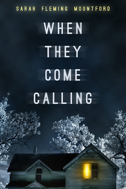
The past several cover designs have all been illustrated, so today I thought it would be fun to share one that was completely different style-wise from what you've seen from me of late. My very favorite thing about this job is the wide variety of projects I get to work on, and the unique challenges each one presents. Some push me to fine tune my skills with type, some force me to watch an online tutorial or five to learn a new special effect in Photoshop, and then others require me to put some time into dusting off my drawing skills and putting my pencil to paper. After each one is wrapped up I end up feeling like a better designer than when I started, and the cover I'm going to share below was no different.

While I love covers that are full of color and texture and showoff some fun special effects, there's definitely something to be said for the more understated covers as well, especially when we're talking about a ghost story. For me, there's something infinitely creepier about what I don't see than what's right in front of me, as what my mind conjures up in an attempt to fill in the blanks is likely far, far worse than the real thing.

With When They Come Calling I really wanted to play up the eeriness of suggestion, giving readers just a tease of what this story holds in store for them so they can then let their imaginations run wild when they take in the cover design and title together. I hope you guys love it!


Physician Anna Roberts runs a free health clinic in Kansas City where she spends her days taking care of the living and avoiding the spirits of the dead. A late night accident leaves Anna at the mercy of the strange man who saved her life, but Anna soon learns that meeting Jed was no coincidence.
As Anna is drawn into Jed's dangerous world and a feud three thousand years in the making, she must come to terms with her own secrets and decide what she will do, when they come calling.

AmazonB&NGoodreads 

You can check out more of my cover design work at Seedlings Design Studio 

Friday, March 25, 2016

Friday Flourish: Masque

Happy Friday and Happy Almost Easter everyone!

I've been celebrating Easter basically since February when my grocery store started stocking Cadbury Mini Eggs, the most delicious chocolatey-goodness ever invented. This weekend will likely consist primarily of massive chocolate consumption, but also some quality family time as well. I hope you all have a wonderful holiday!

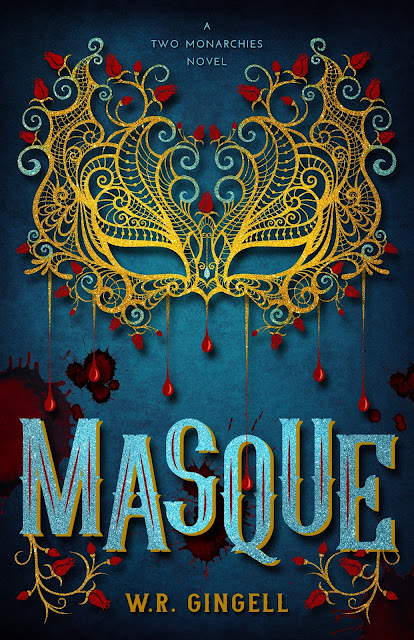
Before I rush off to my date with Mini Eggs though, I have another of my recent cover designs to share with you. I've had an influx of requests for illustrated covers lately, and it's made me ridiculously happy. The design memo author W.R. Gingell submitted for her fairy tale/fantasy novel Masque had me giddy with excitement not only because it's a bit of a Beauty and the Beast retelling and that's my very favorite fairy tale, but also because she emphasized her love for typography. You guys are well aware by now how much I love type and finding the perfect font for any given project, so as with last week's The Broken Crown, I started my design process by searching for the right typeface for Masque.

It didn't take me long to find a front runner – one that had a great deal of character to help create a brand for the series, as well as one that had a regal quality to it befitting the Victorian-era setting. Given the title of the book and the fact that masks themselves play a pivotal role, it seemed as though it might be odd if the design didn't incorporate a mask in some way, so once the type was in place I worked on putting the mask illustration together.

W.R. included a tagline in the artwork form she submitted to me, and when I saw the words "bloody murder", the concept for the mask really fell into place. I incorporated blood drips into the mask itself and added little blood spatter to the background, creating a bit of dark contrast to the gold and glitter of the mask and title. I couldn't be more pleased with how the cover turned out, so I hope you guys love it as much as W.R. and I do!


Beauty met the Beast and there was . . . Bloody murder?
It’s the Annual Ambassadorial Ball in Glause, and Lady Isabella Farrah, the daughter of New Civet’s Ambassador, is feeling pleasantly scintillated.
In the library is Lord Pecus, a charming gentleman whose double mask hides a beastly face, and who has decided that Isabella is the very person to break the Pecus curse.
In the ball-room is young Lord Topher, who is rapidly falling in love with an older woman.
And in the card-room, lying in a pool of his own blood, is the body of one of Isabella’s oldest friends: Raoul, Civet’s Head Guardsman. The papers sewn into his sash seem to suggest espionage gone wrong, but Isabella is not so certain.
Lord Pecus, as Commander of the Watch, is of the opinion that Isabella should keep out of the investigation and out of danger. Isabella is of the opinion that it is her murder to investigate, and that what a certain Beast-Lord doesn’t know won’t hurt him. . . .
Will Isabella find the murderer before Lord Pecus does, or will she end her investigation as a bloody spatter on the parlour floor?

Find Masque:


Find W.R.:


You can check out more of my cover design work at Seedlings Design Studio 

Friday, March 18, 2016

Friday Flourish: The Broken Crown

Happy Friday Everyone!

It's been a cover reveal kind of week this week on the blog, and today I have one of my most recent designs to share with you. I've admitted to my love of illustrated covers before, both as a reader and as a designer, so I'm especially excited about today's Flourish!

Author Amryn Cross came to me wanting an illustrated cover with a strong type treatment, something to catch the eye as well as create a brand for the series, and I may or may not have tripped all over myself in my hurry to get started. There's very little that makes me happier than perusing font sites looking for the perfect typeface for a particular design, and when I came across the one you see below, I knew I needed to look no further for this project.

I started with the title since it was going to be the primary focal point, manipulating the individual letters to make them fit together in a way that made the title an illustration in and of itself. Once I was happy with how the letter shapes flowed together, I moved on to the rest of the illustration. Illustrated covers tend to take me quite a bit longer than photography-based covers, so I sometimes like to submit rough versions of a layout to my clients to make sure I'm heading in the right direction. I thought it might be fun for you guys to see the in-progress black and white version of The Broken Crown before taking a look at the final cover, so below is the proof I sent to Amryn for overall concept and font approval:


I was madly in love with the type treatment and the crown, and luckily for me, Amryn gave her enthusiastic approval, but there were still some things that needed tweaking. I felt like the title and the crown were too separate, something that became even more apparent when I started adding color and texture, so I sought to make them visually relate to one another a touch more in order to unify the design. I also simplified the cityscape at the base of the crown to make it more recognizable at a smaller size, and redrew a number of the flame shapes in the background. A few additional adjustments were made to the title, and after working and reworking the overall color scheme a couple times I arrived at what ended up being the final design:


Princess Emilia Aurelius was only seven when she watched her mother die at the hands of her father—martyred for believing in the God of the Atlas Empire’s Insurgo rebels. At seventeen, exiled to a military outpost where no one knows her true identity, she’s vowed to leave her royalty behind and explore the truth of the Insurgo rebels her mother loved.

When the Emperor of Atlas summons the princesses from each of the provinces to the imperial city to choose a wife for the crown prince, Emilia must leave her military life behind to join a royal court rife with cunning and intrigue. Navigating the waters of court politics and budding love are treacherous on their own, but Emilia fears for her life should anyone learn of her Insurgo sympathies.

With an unlikely ally in the captain of the emperor's guard, Emilia must uncover the truth of the Insurgos, start a revolution, and learn to become the princess she’s vowed never to be, all while protecting her heart from a prince who could sign her death warrant.

Find The Broken Crown:
(releases May 23rd!)

AmazonB&NGoodreads 

Find Amryn:


You can check out more of my cover design work at Seedlings Design Studio 

Wednesday, March 16, 2016

Wednesday Flourish (+ Giveaway!): Memories of Ash

Hey Everyone!

It's going to be a double-Flourish kind of week this week, so I hope you guys don't mind me bombarding you with new cover designs! The cover I'm featuring today was actually completed back in 2014, so I'd just like to take a moment to pat myself on the back for not sharing it the minute it was approved. Patience is not my strong suit when it comes to things I'm excited about, so the past year and a half has been a real test. *rewards self with chocolate and cookies*

BUT TODAY IS THE DAY! Finally I get to share with you the cover for Memories of Ash, the sequel to Intisar Khanani's YA fantasy novel Sunbolt. Sunbolt (and Intisar herself) will always have a special place in my heart as it was my first commissioned cover, and I can't thank Intisar enough for taking a chance on me after only seeing a few of my cover redesigns on the blog. Since Sunbolt, I've done nearly 100 covers, something I never dreamed possible before I received Intisar's inquiry. Thank you, Intisar, for helping me launch my dream!

Now that I've digressed and gotten all mushy on you, let's get back to the reveal shall we? First, a reminder of the cover for Sunbolt:


And now Memories of Ash!


In the year since she cast her sunbolt, Hitomi has recovered only a handful of memories. But the truths of the past have a tendency to come calling, and an isolated mountain fastness can offer only so much shelter. When the High Council of Mages summons Brigit Stormwind to stand trial for treason, Hitomi knows her mentor won’t return—not with Arch Mage Blackflame behind the charges.
 

Armed only with her magic and her wits, Hitomi vows to free her mentor from unjust imprisonment. She must traverse spell-cursed lands and barren deserts, facing powerful ancient enchantments and navigating bitter enmities, as she races to reach the High Council. There, she reunites with old friends, planning a rescue equal parts magic and trickery.
 

If she succeeds, Hitomi will be hunted the rest of her life. If she fails, she’ll face the ultimate punishment: enslavement to the High Council, her magic slowly drained until she dies.

Pre-order Memories of Ash!

AmazonB&NGoodreads 

 Intisar is running a very special pre-order campaign for Memories of Ash, so I'll let her tell you all about it!

Not only is the pre-order of Memories of Ash on sale for only 99 cents, but anyone who buys the pre-order will receive a free digital art print of Hitomi by artist Grace Fong. Just email your proof of purchase to moapreorder@gmail.com!
 
Haven't read Sunbolt (Book 1) yet? It's been knocked down to just 99 cents to celebrate the release and is available at most major e-retailers. That's two fantastic books for less than a cuppa joe.


• • • • • • • • • • • • • • •

GIVEAWAY
 

a Rafflecopter giveaway

Thursday, March 10, 2016

Thursday Flourish: A Stolen Kiss

Confession: This post was meant to go up tomorrow and be a regular Friday Flourish post, but sadly I'm way behind on all things blog related and I haven't finished the book that was supposed to be reviewed today. *hangs head* So, Thursday Flourish it is!

Author Kelsey Keating came to me through a referral from longtime client Katie Cross, and I know if Katie sends someone my way, I'm in for a design treat. Kelsey was absolutely no exception, and from the minute she submitted her artwork form I knew exactly what I wanted this cover to be. Her story is one of adventure, magic and a little romance, all woven together to form a YA Fantasy package that's a bit more on the fun side than the overly serious side.

I knew from the beginning that this book was the start of a series, so I made sure to take that into account when putting the layout together. I wanted to create something sweet and whimsical with just a hint of danger, but also something that left me with plenty of flexibility to adapt for future books.

One of the main story elements Kelsey mentioned was Fangralee Forest, a forest so dense that little to no light filters through, and once I read that description I knew instantly I wanted a design full of ominous trees that would both hint at danger as well as create a nice contrast to a cute fairy-tale feeling castle and type treatment.

I started with the type treatment since I wanted it to be a strong focal point, and then built the trees and castle around the title illustration. After a few rounds of color revisions, Kelsey and I found ourselves with a finished cover!


A stolen kiss.
An unstable curse.
One big mess in the making.

Derric Harver never expected to amount to anything more than the palace stableboy, but when Princess Maria's curse keeps her from accepting a prince's proposal, she turns to him for help, and he doesn't dare refuse.

With the help of a lady's maid and a prince, Derric and Maria embark on a dangerous adventure to find the sorceress who cast the curse. Along the way they battle deadly creatures and make new friends--all the while struggling with the undeniable chemistry between them. Reaching their destination won't be easy, but the true danger peril in the truths they've fought for years to keep hidden.


A Stolen Kiss is the first in the Stolen Royals Series--an adventure with magical creatures, dangerous lies, and being true to the power within.

Find Kelsey:


You can check out more of my cover design work at Seedlings Design Studio 
 

Wednesday, February 24, 2016

Wednesday Flourish: Hidden in Plain Sight

I always love sharing my design work with all of you, so I'm really excited today to reveal the cover for Hidden in Plain Sight, the fourth book in the Serenity's Plain Secrets series by Karen Ann Hopkins. Karen is one of my longtime clients, and we've worked together on so many projects now that we've become a bit of a well-oiled machine which is really fun.

Usually Karen shoots me an email before we start a cover with a few key things she's looking for, and then lets me run with those ideas as I collect various images and group them into basic concepts to submit for approval. With this cover though Karen didn't have the same kind of specific imagery in mind as she's had for previous designs, and I'm grateful that she trusted me enough to let me try and point us both in the right design direction.

Amish stock imagery is poor at best, so it's always a bit of a challenge for me to create a cover for this series that suggests an Amish country setting while still having that ominous murder mystery feel. With this newest cover Karen wanted the Amish element to be a bit more front and center than in previous books, so it took a little extra magic to help me find my way to the final cover and I couldn't be happier with the result.

I hope you guys love how it turned out!


When a cold case heats up, Serenity won’t stop until she discovers the truth.
In the fourth installment of the bestselling Serenity’s Plain Secrets’ series, Serenity must work with US marshals to uncover the truth behind a shockingly brutal fifteen-year-cold murder.
Desperate for answers, Serenity finds herself in Lancaster County, Pennsylvania, where she unravels secrets that threaten to tear her and Daniel apart. But digging up the past is dangerous, and the quaint Amish settlement isn’t as safe as it seems.
If Serenity chooses to trust the man she’s come to love, it could mean a happily ever after… or her final act.


• • • • • • • • • • • • •

Be sure and check out the previous books in the series!

SECRETS IN THE GRAVE
Serenity's Plain Secrets #3


Just when Sheriff Serenity Adams thinks life is getting back to normal, the death of a young, pregnant Amish woman rocks the community. Is it circumstance…or murder? It’s up to Serenity and her ex-Amish boyfriend, Daniel Bachman, to discover the truth about the new shaman-type medicine man who’s brought his dark secrets to Blood Rock.

But Serenity has secrets of her own, and if she and Daniel don’t work it out, the reappearance of a woman from his past could threaten to ruin their relationship.

The deeper Serenity delves into the magical world of Amish herbal medicine, the phenomenon of laying of the hands and other cultural healing oddities, the more she wonders if miracles are real. What she witnesses with her own eyes may be too fantastical for her to believe.

In this riveting third installment of Serenity’s Plain Secrets, beliefs are challenged, a way of life is questioned and family skeletons are unearthed, leaving no one untouched.  


WHISPERS FROM THE DEAD
Serenity's Plain Secrets #2


Some Amish communities aren't so cozy.
Whispers From The Dead is the powerful and thrilling sequel to Lamb to the Slaughter, in the Amish mystery series, Serenity’s Plain Secrets.

Sheriff Serenity Adams and Daniel Bachman are once again partnered up in a criminal investigation, when they travel to a northern Amish settlement that has been riddled by arsons for the past two decades. Serenity quickly discovers that there is much more going on than just barns being set on fire in the touristy community, and that the new group of Amish has their own secrets to hide. She begins to unravel an extensive criminal underworld that threatens to destroy everything that the simple people of Poplar Springs hold dear and once again puts her own life in jeopardy.

And even though Serenity tries desperately to avoid it, things begin heating up between her and Daniel, making her wonder if true love and happiness are really within her grasp.


LAMB TO THE SLAUGHTER
Serenity's Plain Secrets #1


Lamb to the Slaughter is a story about the intertwining lives of three unlikely people in an Indiana Amish Community and the devastating results when a rebellious teenage girl is found shot to death in a corn field during the harvest.

Serenity Adams is the newly elected young sheriff in the country town of Blood Rock and besides dealing with the threatening behavior of her predecessor, she now has a dead Amish girl on her plate.  At first glance, the case seems obvious.  The poor girl was probably accidently shot during hunting season, but when the elders of the Amish community and even the girl’s parents react with uncaring subdued behavior, Serenity becomes suspicious.  As she delves deeper into the secretive community that she grew up beside, she discovers a gruesome crime from the past that may very well be related to the Amish girl’s shooting.

Serenity enlists the help of the handsome bad-boy building contractor, Daniel Bachman, who left the Amish when he was nineteen and has his own dark reasons to help the spunky sheriff solve the crime that the family and friends who shunned him are trying desperately to cover up.  Serenity’s persistence leads her to a stunning discovery that not only threatens to destroy her blossoming romance with Daniel, but may even take her life in the end.


Find Karen:


You can find more of my cover design work at Seedlings Design Studio!

Friday, February 12, 2016

Friday Flourish: Much of Madness

Happy Friday Everyone!

Today I'm crazy excited to share with you another of the covers from my teaser grid a little while back, and it's one that many of you tagged in the comments as being the one you were most curious about.

One of my very favorite parts of cover design is the wide variety of genres I get work within as well as the style of artwork I get to create and manipulate in order to suit the story. As a wedding stationer for 10 years, I did a lot of repetitive artwork like monograms and floral patterns, and it was the rare client who really wanted something outside the box (not an insult to my clients, just the nature of wedding stationery in general). Now, however, every project presents a new and unique challenge for me, and as soon as I saw author S.E. Summa's Pinterest inspiration board for her Southern Gothic Horror novel Much of Madness, I knew I was in for a treat.

For this cover S.E. really wanted the gothic feel to shine through, with rich colors and textures accentuating a skull focal point (a design element that will be carried through to each book in the series - YAY!). The choice of type, while always a vital aspect of any cover, was even more important with Much of Madness to reinforce the overall aesthetic and really create a brand identity for the series as a whole.

S.E. was able to beautifully articulate what she was looking for with this design from the beginning, something that is far harder than it sounds, and together I think we created something striking. I hope you guys think so as well!

MUCH OF MADNESS
Releases 2/29


Seraphina Pearce doesn't know what's more frustrating: her magic's affinity for death, her best friend's transformation into an albino Sin Eater, or that simply touching a guy she loves means someone's headed to the morgue.
After a sin-eating job goes awry, she casts a risky spell and butts heads with a handsome stranger in order to win an infamous grimoire.
Marceau L'Argent is the last person she should confide in because the occult cat burglar has a mysterious past, and he's made it no secret he also wants the grimoire. He recognizes her dark magic and offers his unique help as a rare curse breaker. If all that weren't enough, Marceau causes butterflies in her stomach—a feeling she'd long thought dead.
Seraphina was only trying to break her curse—not piss off Death himself.
MUCH OF MADNESS is a Southern Gothic Horror story about loyalty, sacrifice, and maintaining hope no matter the odds.

 
Find S.E. and Much of Madness:

You can check out more of my cover design work at Seedlings Design Studio 

Friday, January 22, 2016

Friday Flourish: The Separated

Happy Friday Everyone!

A couple weeks ago I teased you all with snippets of six recent cover designs that hadn't yet been officially revealed, but today I get to share one of those covers in full. YAY!

Author Troon Harrison came to me through one of my longtime clients, Shelley Adina, and with one word she had me clapping excitedly and demanding to start immediately. What was that word you ask? UNICORNS. Unicorns! When I was little I was absolutely obsessed with an animated movie called The Last Unicorn (anyone else? Yes? No? No. Just me then. Awesome.), and longed for the day when it would be revealed that unicorns actually existed. Sadly, that day still hasn't come.

What did finally come though was the opportunity to bring a unicorn story to life through its cover, and I loved every minute I spent collaborating on this design with Troon. Obviously the presence of a unicorn was more than enough to suggest high fantasy, but I wanted the entire design to have a magical, enchanted feel, so I played a lot with various lighting effects around the unicorn as well as in the type itself. The end result is everything I hoped it would be when I first read through the design memo, and I hope you guys love it as well!

THE SEPARATED
Tales of Terre #1


Long ago, a fierce sea dragon sank a ship that carried two Golden Horns and their Keeper. The creatures—with power against darkness—were separated, and passed into myth. But now evil grows, for the cruel Lord Maldici guards a terrible secret in his mountain stronghold. He studies the black book of sorcery, and sends out spies to quest for the missing Golden Horn.

Vita is the youngest descendant in the long line of Keepers. Her magic must preserve the remaining Golden Horn in safety, for only its power can thwart the growing evil. Yet Vita is in danger of betraying her trust. Her best friend, the pirate Giovanni, struggles to break free of the gold-greed that enslaves his people. Only then can he aid Vita, and vanquish the dragon in battle. But when Vita wavers, Giovanni's life will be at risk in the dungeons of Lord Maldici. One other person will aid them: Marina, outcast daughter of a sea witch, searching for a home in the land of Verde. Overcoming their differences, these three must find courage to save what they love most from the gathering power of darkness.

Find Troon:


You can check out more of my cover design work at Seedlings Design Studio

Friday, January 8, 2016

Friday Flourish: 2016 Preview

Happy Friday Everyone!

Today I have different type of flourish post to kick off 2016, one that includes a sneak peek at a few of the covers I'll hopefully be revealing in their entirety over the next couple weeks/months. The last several months of 2015 saw a marked increase in work for me–something that makes me want to do the spastic flail I call a happy dance–so I thought it might be fun to put together a little teaser grid before the full reveals go live.

I had such a blast working on each and every one of these covers, they're all incredibly different in style and feel, and each brought a new and interesting design challenge for me to try and meet.

I'd love to know which of the boxes has you most curious, so please leave your pick in the comments!


You can check out more of my cover design work at Seedlings Design Studio!

Friday, December 18, 2015

Cover Evolution: Tempest

Happy Friday Everyone!

As you guys already know, I revealed the cover for the third book in the Wings of War series on Wednesday, and since the past couple cover evolution posts I've done have gone over really well, I thought it might be fun to do one for Tempest.

The covers for this series are all fairly special effects-heavy, meaning they require a lot of compositing different images together in order to fit Ember in various environments and craft the element-based wings as a focal point. Karen envisioned a stormy scene for Tempest, with Ember standing amid crashing waves as the water wings flare from her back, so my first order of business was to find a fitting background image.


When I came across this photograph I knew I'd found exactly what I was looking for, with one obvious exception: There was man in a business suit where I needed Ember to be. Removing a figure from an image in Photoshop can be tricky and time consuming depending on the background given you have to fill in what would otherwise be the empty white space left by the figure being removed. Luckily for me, the texture of the sky, water and rocks made his removal fairly easy, and after adding a bit more color and a few stormier clouds, I had Ember's perfect Tempest environment.


Next up was to add Ember herself. Karen and I always want to make sure each cover feels cohesive within the series while still standing out as unique, so with Tempest Karen wanted Ember to be partially turned and looking over her shoulder instead of simply facing forward. Finding a single stock image of a young woman who looked like the previous models we'd used while wearing non-ridiculous clothing (so many of them were in dresses and high heels - not really what one would wear climbing rocks by the sea) and with her head turned to the side proved to be an impossible task, so I needed to combine several different girls and Frankenstein Ember together.


I used the body of the top left figure and the head of the top right, but ran into a little issue given one had straight hair and one curly. Since the girl on the right also had shorter hair than the left, I needed to bring in a third image in order to blend the two and create a fuller head of wavy hair. I also wanted to make sure Ember's hair had movement since she was facing down a stormy, windy sea, so the bottom image proved to be just the ticket.

Obviously the hair color, skin tone, and lighting of all three images is slightly different, so even when I got all the pieces together in a single figure, it was still a bit of a mess visually:


As you can see, the hair is a patchwork of various colors and textures, and her skin is way too warm to be believable in this environment. After a fair number of color tweaks and adjustments, I was able to make Ember look not only like a single person but also more like she belonged on that rocky outcrop.


At this point, the trickiest parts were behind me and I was able to really let myself have fun building the wings. As with Embers and Gaia, I started with just the flat illustration of the wings before adding a base layer water texture to give them a little depth.


From here, I layered various water splashes in all shapes and sizes across the wings, masking the wing shape in a few places so it appears sections here and there are made entirely made of water, but overall they still retain the shape that links them to the previous two books.


The final step was to add in the title, tagline and Karen's name, as well as some additional water spray in and around the rocks to really give this cover a lot of movement, and the result was our final Tempest!


Ember must stop the apocalypse from happening, but at what cost?

The Angels of destruction have arrived, and only Ember stands in the way of their mission to carry out God’s wrath and annihilate His enemies.

When the barrier between celestial creatures and humans beings is broken and Angels descend to Earth, Ember soon learns there’s a fine line between good and evil. As she faces a world full of monsters and magic, a terrifying darkness rises and threatens to destroy everything she’s fighting for.

In the riveting third installment of The Wings of War series, Ember and her friends embark on an epic journey, where unlikely allies are forged and age-old beliefs crumble to dust. And just when Ember accepts love in her life, it’s ripped away from her in the most terrifying way possible.


Tempest releases late January 2016

Find Embers:

Find Gaia: