Showing posts with label Friday Flourish. Show all posts

Friday, July 15, 2016

Friday Flourish: Concealed + Exposed

Happy Friday Everyone!

It's disgustingly hot here (if it's under 93 degrees where you live, let me know where that is so I can move immediately. If it's over 93, let me know where you are too so I can avoid it ;-)), so I have an indoor kind of weekend ahead of me. *basks in the air conditioning*

One of my recent projects was a young adult post-apocalyptic series, a genre that had me really excited because I haven't done many covers in the way of post-apocalyptic or dystopian designs, and you guys know how much I love a new kind of challenge. When I know a book is going to be a part of a series, my overall design process takes a different path than with standalone covers as I need to make sure what I create for the first book has adaptability and branding potential moving forward. I want to make sure each book in the series fits with one another while still making a strong statement on its own, so with the Virus series author RJ Crayton and I spent quality time in the planning process figuring out just how we would connect each book visually.

RJ new she wanted a more symbol-focused design, a strong focal point in the middle that would stay the same book to book while the color scheme and textures would change to reflect each individual story. Given Concealed and Exposed both dealt with a viral outbreak and its aftermath, the biohazard symbol seemed like the perfect fit – a bold warning to catch the eye and hopefully intrigue enough to make readers want to know more.

I wanted to share both covers today so you could see how they worked together as a pair, and stay tuned for book three, Contained, in the coming months! I hope you guys love how they turned out:)

They said it was extremely hard to get.
They said it wasn’t airborne.
They said there was nothing to fear.
They were wrong.

Seventeen-year-old Elaan Woodson was supposed to be one of the lucky ones. She got one of the few spots in the subterranean protection unit designed to keep select scientists, military officials and their families safe from the deadly virus ravaging the world above.
But, how lucky are you really when the people in charge and those you love keep secrets from you? 

While Elaan has heard that what you don’t know can’t hurt you, she’s beginning to think otherwise. And she should…

GoodreadsAmazon


The safety of the underground bunker is left behind. Elaan and her friends are out in the open, exposed to the world above. Exposed to a world that has been ravished by the virus. Can they make it to the one person they've been told can provide them safety?


Find RJ:


You can check out more of my design work at Seedlings Design Studio  

Friday, June 24, 2016

Friday Flourish: I'll Be Yours

Happy Friday Everyone!

I hope you guys are all having a great summer so far! Mine is flying by, I can't believe it's almost July already. Since the official first day of summer was this week, I thought I'd share a recent cover design that's perfect for your summer reading lists (even if technically football takes place in the fall ;-))!

As much as I love illustrated covers and effects-heavy designs for all that they teach me new and fun things in Photoshop, it's equally rewarding to work on projects that are a little more straightforward visually and focus on the simple gorgeousness of color, type or photography. Author Jenny B. Jones got in touch with me for one of her recent releases, a sports-themed contemporary YA romance, and I had an absolute blast bringing I'll Be Yours to life on the cover!

While I of course wanted this cover to feel like it fit with the genre, I also wanted to make it as unique as possible, incorporating the football element in a more subtle way. For the main image we focused on a specific lakeside scene from the book, but I knew I needed to bring the football element in as well since it played such a pivotal role. I could have gone with a university-style font consisting of large block letters that scream sports, but since that's been done and done well on a number of covers, I wanted to take us in a slightly different direction. I found a big, bold and rounded font with tons of personality that I knew I needed in my life immediately, and once I saw it in place, how to introduce the football element finally clicked for me. Since both football plays and romance can be expressed with x's and o's, I thought it would be cute to bounce them in and around the type, making the title treatment a strong visual statement against the colorful sunset sky.

I absolutely love how this one turned out, so I hope you guys do too! Plus, any cover with a dog on it is an automatic winner to me:)


She’s the coach’s brilliant daughter, clueless about love. He’s the dethroned football star, ready to teach Romance 101. When dark secrets and sparks collide, there’s no playbook for what happens next.

The day Andrew Levin arrives at Washington High, Harper O’Malley knows he’ll make the perfect starter boyfriend. The school’s newest band geek is totally in Harper’s league, yet completely out of this late-bloomer’s reach. Between fitting in with a new family, scoring the first chair in band, and rescuing dogs for the local animal shelter, Harper’s never had the opportunity to hone her dating skills. But even though Harper’s love life is far from perfect, she’s got the perfect plan.

Harper knows she’s insane to agree to tutor Ridley Estes, a notorious heartbreaker and the star of her high school’s football team—but in exchange, he’s offered to school her in the game of love. Just when she sees promise with her crush, a football scandal rocks her family, her town, and Ridley’s entire future. Harper suddenly has everything to lose—her family, friends, and even her heart. When the dust of the scandal settles, nothing will be the same. Including the girl who asked the most popular jock to teach her about love.

Find Jenny:


You can check out more of my design work at Seedlings Design Studio 

Friday, June 10, 2016

Friday Flourish: They Mostly Come Out At Night

Happy Friday Everyone!

It's been a little while since I've shared a recent cover design, and in light of a very cool honor for the one I'm posting today, I wanted you guys to see it!

Author Benedict Patrick told me early on in our talks that he had his heart set on one of my illustrated covers, and as soon as I read through the design memo he submitted, I knew what we came up with was going to be one of my very favorites. You all already know how much I love illustrated covers in general, and when they're in the dark fantasy genre I get even more excited (if that's even possible), so I was essentially vibrating with glee when I started the initial artwork for They Mostly Come Out At Night.

Benedict had asked that the focal point of the illustration revolve around the mask his Magpie King wears as it plays a vital role, so I started putting the core elements in place with a strong emphasis on movement and texture, and then added a large full moon and bare tree branches to up the ominous vibe. Lastly, I added the type, incorporating a font I fell madly in love with the moment I saw it and knew I had to have it for this cover.

After a few small tweaks, we had our finished cover! As I said before, it's in my top 5 covers I've done, so I was inordinately pleased and honored when Benedict entered They Mostly Come Out At Night into the Self-Published Fantasy Blog-Off and, out of hundreds of entries, it was shortlisted (along with Masque!) and joined 30 others for final voting. I'm in some exquisite company, so be sure and check them all out when you get a chance!

THEY MOSTLY COME OUT AT NIGHT
Releases June 16th


He locked himself away from the dark, but in the Magpie King’s forest nowhere is safe…

Lonan is an outcast, accused of letting the monsters that stalk the night into the homes of his fellow villagers. Now, he will not rest until he wins back the heart of his childhood love and reclaims the life that was stolen from him. However, locked safely in his cellar at night, in his dreams Lonan finds himself looking through the eyes of a young prince…

Adahy has a destiny, and it terrifies him. How can he hope to live up to the legend of the Magpie King, to become the supernatural protector of the forest and defender of his people? But when the forest is invaded by an inhuman force, Adahy must rise to this challenge or let the Wolves destroy his people.

Watching these events unfold in his sleep, Lonan must do what he can to protect his village from this new threat. He is the only person who can keep his loved ones from being stolen away after dark, and to do so he will have to earn back their trust or watch the monsters kill everyone that he holds dear.


You can check out more of my design work at Seedlings Design Studio 
 

Friday, May 20, 2016

Friday Flourish: Elemental Assassin Coloring Bookmarks!

Happy Friday Everyone!

I don't know about you guys, but I'm very, very ready for the weekend. BEA last week was its usual whirlwind of awesome (a recap will be coming at some point), but it's exhausting, and because I have the worst luck ever when it comes to air travel, we were of course delayed in getting home. We got home late Saturday, and then on Sunday drove 6 hours to pick up Mya, the newest pit bull addition to our family. The drive was more than worth it as she and Gracie are becoming fast friends, but all this week I've had trouble staying up past 9. *blinks wearily*

But enough about being tired! It's Friday and I have a very different kind of Flourish post to share with you today. While book covers are my primary focus, I do occasionally get design requests for related things like bookmarks, teaser quotes and the like, so when Jennifer Estep (one of my longtime favorite authors) got in touch about doing a coloring bookmark for her outstanding Elemental Assassin series, I jumped at the chance to do something entirely new to me.

Adult coloring books are all the rage at the moment (I need more in my life!), so I loved the idea of a coloring bookmark. Heroine and all-around badass Gin runs a restaurant called the Pork Pit when she's not putting her silverstone knives to good use, so Jennifer thought it might be fun to design something around all the mouthwatering comfort foods Gin dishes up in each book. On the back we brought in some of the Elemental Assassin branding elements, with Gin's spider rune and her classic tagline as the focal points. I hope you guys love how they turned out!

Front:


Back:


Want an Elemental Assassin coloring bookmark of your very own? Here's how you can get one:
Get your swag on! For 2-3 stamps, Let's Talk Promotions will stuff an envelope full of Jennifer Estep swag so you can keep some swag and give away some to interested parties. Just send a self-address stamped envelope with two stamps on it to Let's Talk Promotions, P.O. Box 241721, Milwaukee, WI 53224 and mark "Jennifer Estep" on your envelope. Currently, LTP has swag for Gin Blanco and the Elemental Assassin series.

Let's Talk Promotions also offers swag for fantasy author Faith Hunter. If you want some of Faith's swag, follow the instructions above and mark "Faith Hunter" on your envelope. Cheers!

Find Jennifer:


You can check out more of my design work at Seedlings Design Studio 

Friday, April 29, 2016

Friday Flourish: Another Sneak Peek!

Happy Friday Everyone!

A few months back I featured a fun little teaser with small snippets of recent designs, and since it seemed to go over well I thought I'd go ahead and share another one!

As you guys have noticed by now, I've had to scale back a bit with the blog, taking Monday's off and calling in reinforcements in the form of my family to help me keep up with reviews. *sigh* Work has really taken off since January of this year which is hugely exciting, but it has definitely limited my reading time. I've also found that even when I do have time to read, I'm just not as motivated as I once was. Part of it is the fact that my work and this blog are now linked in that they're both book-related, so even though I absolutely LOVE my job and this blog, when I get time off, I want that time completely off from anything involving books. Also, Netflix has clutched me to its evil bosom and will not let me go until I've watched ALL THE THINGS. *wanders off to binge watch season 7 of The X Files*

I do love bringing my work life and blogging life together and sharing my covers on Fridays though, so I hope you guys won't mind me indulging in my shameless self-promotion once again:)

Artwork is hugely subjective, and it's always so interesting to me to see what kind of imagery or typography really jumps out at people, so please let me know in the comments which box most catches your eye. I hope to share all 6 of these in their entirety soon!


You can check out more of my cover design work at Seedlings Design Studio 

Friday, April 22, 2016

Friday Flourish: The Illuminator's Gift

Happy Friday Everyone!

Today I'm sharing the cover for The Illuminator's Gift, the first book in a middle grade fantasy series by Alina Sayre. As you guys already know, fantasy is my very favorite genre to read, but it has also quickly become one of my very favorite genres to design as well since the sky is the limit creativity-wise. While I thoroughly enjoy the challenges each new project presents regardless of genre, fantasy tends to let my imagination run a little more wild than most, and I always have the best time trying to figure out how to bring a story's magical elements to life.

With illustrated covers, my design style tends to be more stylized, with the imagery existing as flat shapes, large planes of color, and lots of texture rather than realistic, painterly or true to life. My initial idea boards for Alina went in my more typical stylized direction, with the sea, sky and flying ship focal points she wanted highlighted shown with clean, crisp lines and clearly defined shapes. After reviewing the boards, Alina asked if we could change the feel of the imagery, taking the illustrations in a more realistic direction and softening the edges overall–a style that wasn't quite as familiar to me.

Having to step outside my design comfort zone is part of what makes this job so much fun though, and by the time I finished putting the initial comp of The Illuminator's Gift together I had learned a variety of new tricks, something that never fails to make me happy. After a few tweaks to the title font and accompanying flourishes, we had our final cover where sea meets sky and the Legend emerges from a wisp of cloud as she flies through the air.

Alina and I are currently working on the covers for books two and three, so stay tuned for those in the coming months!


Ellie is a twelve-year-old orphan who desperately wants a family. She just doesn’t expect to find one when she joins the crew of the Legend, a flying ship in a secret rescue fleet. On board, she meets a boy with a pet tarantula, a bully with eyes like mirrors, and a librarian who can read eighteen languages. Unexpectedly, Ellie also discovers a powerful gift that only she can wield. But when the Legend is called to a dangerous rescue mission, Ellie risks losing everyone she loves. Will her mysterious gift be enough to save her and her friends from a deadly enemy bent on destroying their world?
 
Find Alina & The Illuminator's Gift:
 
You can check out more of my cover design work at Seedlings Design Studio 
 

Friday, April 1, 2016

Friday Flourish: When They Come Calling

Happy Friday Everyone!

This will be the last Flourish post for a couple weeks as I have a few things planned for the coming Fridays, but I still have 18 recent covers I've yet to share with all of you, so more Flourish posts will be forthcoming!

The past several cover designs have all been illustrated, so today I thought it would be fun to share one that was completely different style-wise from what you've seen from me of late. My very favorite thing about this job is the wide variety of projects I get to work on, and the unique challenges each one presents. Some push me to fine tune my skills with type, some force me to watch an online tutorial or five to learn a new special effect in Photoshop, and then others require me to put some time into dusting off my drawing skills and putting my pencil to paper. After each one is wrapped up I end up feeling like a better designer than when I started, and the cover I'm going to share below was no different.

While I love covers that are full of color and texture and showoff some fun special effects, there's definitely something to be said for the more understated covers as well, especially when we're talking about a ghost story. For me, there's something infinitely creepier about what I don't see than what's right in front of me, as what my mind conjures up in an attempt to fill in the blanks is likely far, far worse than the real thing.

With When They Come Calling I really wanted to play up the eeriness of suggestion, giving readers just a tease of what this story holds in store for them so they can then let their imaginations run wild when they take in the cover design and title together. I hope you guys love it!


Physician Anna Roberts runs a free health clinic in Kansas City where she spends her days taking care of the living and avoiding the spirits of the dead. A late night accident leaves Anna at the mercy of the strange man who saved her life, but Anna soon learns that meeting Jed was no coincidence.
As Anna is drawn into Jed's dangerous world and a feud three thousand years in the making, she must come to terms with her own secrets and decide what she will do, when they come calling.

AmazonB&NGoodreads 

You can check out more of my cover design work at Seedlings Design Studio 

Friday, March 25, 2016

Friday Flourish: Masque

Happy Friday and Happy Almost Easter everyone!

I've been celebrating Easter basically since February when my grocery store started stocking Cadbury Mini Eggs, the most delicious chocolatey-goodness ever invented. This weekend will likely consist primarily of massive chocolate consumption, but also some quality family time as well. I hope you all have a wonderful holiday!

Before I rush off to my date with Mini Eggs though, I have another of my recent cover designs to share with you. I've had an influx of requests for illustrated covers lately, and it's made me ridiculously happy. The design memo author W.R. Gingell submitted for her fairy tale/fantasy novel Masque had me giddy with excitement not only because it's a bit of a Beauty and the Beast retelling and that's my very favorite fairy tale, but also because she emphasized her love for typography. You guys are well aware by now how much I love type and finding the perfect font for any given project, so as with last week's The Broken Crown, I started my design process by searching for the right typeface for Masque.

It didn't take me long to find a front runner – one that had a great deal of character to help create a brand for the series, as well as one that had a regal quality to it befitting the Victorian-era setting. Given the title of the book and the fact that masks themselves play a pivotal role, it seemed as though it might be odd if the design didn't incorporate a mask in some way, so once the type was in place I worked on putting the mask illustration together.

W.R. included a tagline in the artwork form she submitted to me, and when I saw the words "bloody murder", the concept for the mask really fell into place. I incorporated blood drips into the mask itself and added little blood spatter to the background, creating a bit of dark contrast to the gold and glitter of the mask and title. I couldn't be more pleased with how the cover turned out, so I hope you guys love it as much as W.R. and I do!


Beauty met the Beast and there was . . . Bloody murder?
It’s the Annual Ambassadorial Ball in Glause, and Lady Isabella Farrah, the daughter of New Civet’s Ambassador, is feeling pleasantly scintillated.
In the library is Lord Pecus, a charming gentleman whose double mask hides a beastly face, and who has decided that Isabella is the very person to break the Pecus curse.
In the ball-room is young Lord Topher, who is rapidly falling in love with an older woman.
And in the card-room, lying in a pool of his own blood, is the body of one of Isabella’s oldest friends: Raoul, Civet’s Head Guardsman. The papers sewn into his sash seem to suggest espionage gone wrong, but Isabella is not so certain.
Lord Pecus, as Commander of the Watch, is of the opinion that Isabella should keep out of the investigation and out of danger. Isabella is of the opinion that it is her murder to investigate, and that what a certain Beast-Lord doesn’t know won’t hurt him. . . .
Will Isabella find the murderer before Lord Pecus does, or will she end her investigation as a bloody spatter on the parlour floor?

Find Masque:


Find W.R.:


You can check out more of my cover design work at Seedlings Design Studio 

Friday, March 18, 2016

Friday Flourish: The Broken Crown

Happy Friday Everyone!

It's been a cover reveal kind of week this week on the blog, and today I have one of my most recent designs to share with you. I've admitted to my love of illustrated covers before, both as a reader and as a designer, so I'm especially excited about today's Flourish!

Author Amryn Cross came to me wanting an illustrated cover with a strong type treatment, something to catch the eye as well as create a brand for the series, and I may or may not have tripped all over myself in my hurry to get started. There's very little that makes me happier than perusing font sites looking for the perfect typeface for a particular design, and when I came across the one you see below, I knew I needed to look no further for this project.

I started with the title since it was going to be the primary focal point, manipulating the individual letters to make them fit together in a way that made the title an illustration in and of itself. Once I was happy with how the letter shapes flowed together, I moved on to the rest of the illustration. Illustrated covers tend to take me quite a bit longer than photography-based covers, so I sometimes like to submit rough versions of a layout to my clients to make sure I'm heading in the right direction. I thought it might be fun for you guys to see the in-progress black and white version of The Broken Crown before taking a look at the final cover, so below is the proof I sent to Amryn for overall concept and font approval:


I was madly in love with the type treatment and the crown, and luckily for me, Amryn gave her enthusiastic approval, but there were still some things that needed tweaking. I felt like the title and the crown were too separate, something that became even more apparent when I started adding color and texture, so I sought to make them visually relate to one another a touch more in order to unify the design. I also simplified the cityscape at the base of the crown to make it more recognizable at a smaller size, and redrew a number of the flame shapes in the background. A few additional adjustments were made to the title, and after working and reworking the overall color scheme a couple times I arrived at what ended up being the final design:


Princess Emilia Aurelius was only seven when she watched her mother die at the hands of her father—martyred for believing in the God of the Atlas Empire’s Insurgo rebels. At seventeen, exiled to a military outpost where no one knows her true identity, she’s vowed to leave her royalty behind and explore the truth of the Insurgo rebels her mother loved.

When the Emperor of Atlas summons the princesses from each of the provinces to the imperial city to choose a wife for the crown prince, Emilia must leave her military life behind to join a royal court rife with cunning and intrigue. Navigating the waters of court politics and budding love are treacherous on their own, but Emilia fears for her life should anyone learn of her Insurgo sympathies.

With an unlikely ally in the captain of the emperor's guard, Emilia must uncover the truth of the Insurgos, start a revolution, and learn to become the princess she’s vowed never to be, all while protecting her heart from a prince who could sign her death warrant.

Find The Broken Crown:
(releases May 23rd!)

AmazonB&NGoodreads 

Find Amryn:


You can check out more of my cover design work at Seedlings Design Studio 

Friday, February 12, 2016

Friday Flourish: Much of Madness

Happy Friday Everyone!

Today I'm crazy excited to share with you another of the covers from my teaser grid a little while back, and it's one that many of you tagged in the comments as being the one you were most curious about.

One of my very favorite parts of cover design is the wide variety of genres I get work within as well as the style of artwork I get to create and manipulate in order to suit the story. As a wedding stationer for 10 years, I did a lot of repetitive artwork like monograms and floral patterns, and it was the rare client who really wanted something outside the box (not an insult to my clients, just the nature of wedding stationery in general). Now, however, every project presents a new and unique challenge for me, and as soon as I saw author S.E. Summa's Pinterest inspiration board for her Southern Gothic Horror novel Much of Madness, I knew I was in for a treat.

For this cover S.E. really wanted the gothic feel to shine through, with rich colors and textures accentuating a skull focal point (a design element that will be carried through to each book in the series - YAY!). The choice of type, while always a vital aspect of any cover, was even more important with Much of Madness to reinforce the overall aesthetic and really create a brand identity for the series as a whole.

S.E. was able to beautifully articulate what she was looking for with this design from the beginning, something that is far harder than it sounds, and together I think we created something striking. I hope you guys think so as well!

MUCH OF MADNESS
Releases 2/29


Seraphina Pearce doesn't know what's more frustrating: her magic's affinity for death, her best friend's transformation into an albino Sin Eater, or that simply touching a guy she loves means someone's headed to the morgue.
After a sin-eating job goes awry, she casts a risky spell and butts heads with a handsome stranger in order to win an infamous grimoire.
Marceau L'Argent is the last person she should confide in because the occult cat burglar has a mysterious past, and he's made it no secret he also wants the grimoire. He recognizes her dark magic and offers his unique help as a rare curse breaker. If all that weren't enough, Marceau causes butterflies in her stomach—a feeling she'd long thought dead.
Seraphina was only trying to break her curse—not piss off Death himself.
MUCH OF MADNESS is a Southern Gothic Horror story about loyalty, sacrifice, and maintaining hope no matter the odds.

 
Find S.E. and Much of Madness:

You can check out more of my cover design work at Seedlings Design Studio 

Friday, January 22, 2016

Friday Flourish: The Separated

Happy Friday Everyone!

A couple weeks ago I teased you all with snippets of six recent cover designs that hadn't yet been officially revealed, but today I get to share one of those covers in full. YAY!

Author Troon Harrison came to me through one of my longtime clients, Shelley Adina, and with one word she had me clapping excitedly and demanding to start immediately. What was that word you ask? UNICORNS. Unicorns! When I was little I was absolutely obsessed with an animated movie called The Last Unicorn (anyone else? Yes? No? No. Just me then. Awesome.), and longed for the day when it would be revealed that unicorns actually existed. Sadly, that day still hasn't come.

What did finally come though was the opportunity to bring a unicorn story to life through its cover, and I loved every minute I spent collaborating on this design with Troon. Obviously the presence of a unicorn was more than enough to suggest high fantasy, but I wanted the entire design to have a magical, enchanted feel, so I played a lot with various lighting effects around the unicorn as well as in the type itself. The end result is everything I hoped it would be when I first read through the design memo, and I hope you guys love it as well!

THE SEPARATED
Tales of Terre #1


Long ago, a fierce sea dragon sank a ship that carried two Golden Horns and their Keeper. The creatures—with power against darkness—were separated, and passed into myth. But now evil grows, for the cruel Lord Maldici guards a terrible secret in his mountain stronghold. He studies the black book of sorcery, and sends out spies to quest for the missing Golden Horn.

Vita is the youngest descendant in the long line of Keepers. Her magic must preserve the remaining Golden Horn in safety, for only its power can thwart the growing evil. Yet Vita is in danger of betraying her trust. Her best friend, the pirate Giovanni, struggles to break free of the gold-greed that enslaves his people. Only then can he aid Vita, and vanquish the dragon in battle. But when Vita wavers, Giovanni's life will be at risk in the dungeons of Lord Maldici. One other person will aid them: Marina, outcast daughter of a sea witch, searching for a home in the land of Verde. Overcoming their differences, these three must find courage to save what they love most from the gathering power of darkness.

Find Troon:


You can check out more of my cover design work at Seedlings Design Studio

Friday, January 8, 2016

Friday Flourish: 2016 Preview

Happy Friday Everyone!

Today I have different type of flourish post to kick off 2016, one that includes a sneak peek at a few of the covers I'll hopefully be revealing in their entirety over the next couple weeks/months. The last several months of 2015 saw a marked increase in work for me–something that makes me want to do the spastic flail I call a happy dance–so I thought it might be fun to put together a little teaser grid before the full reveals go live.

I had such a blast working on each and every one of these covers, they're all incredibly different in style and feel, and each brought a new and interesting design challenge for me to try and meet.

I'd love to know which of the boxes has you most curious, so please leave your pick in the comments!


You can check out more of my cover design work at Seedlings Design Studio!

Friday, October 23, 2015

Friday Flourish: Rafe Ryder + The Well of Wisdom

Happy Friday Everyone!

I have another fun project to share with you this week, one I'm immensely proud of and sincerely hope you guys end up loving as much as I do.

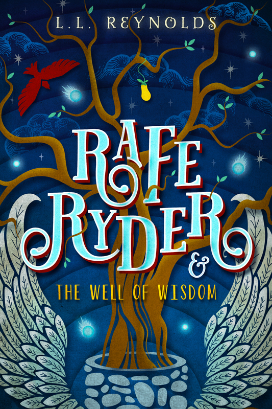
Author L.L. Reynolds got in touch with me thanks to the amazing Katie Cross (who has been one of my biggest supporters), and as soon as I read the words "middle grade fantasy" in her inquiry email I hit reply with record speed. What followed was a collaboration full of laughs and over the top enthusiasm on both sides, and I can't thank L.L. enough for her unwavering trust as she handed me her book and simply said "do whatever you need to do to make this cover the best it can be".

Since this was middle grade, we both knew we wanted an illustrated design, something full of color, texture, and movement that would really draw the eye of readers young and old. I also wanted to design this first book with the entire series in mind, creating a Rafe Ryder brand that would be carried through each subsequent book, so I started with my core elements (which included the title treatment and a pair of wings) and then built out from there.

Since this first book is titled The Well Of Wisdom, I wanted to make sure the well itself appeared on the cover along with its very important counterpart, The Tree of All Knowledge, and I then completed the design with a few other small elements to try and bring this fantastical world to life.

For fun, I thought you guys might like to see the initial sketch I sent to L.L. for approval before I began putting the design together on the computer, if for no other reason than it will give you a good laugh. For all that I'm artistic, drawing on paper really isn't my strong suit ;-)


Glorious isn't it? *pats self on back*

I think the final version turned out a touch better...


Strange things happen when the place you call "home" is no longer your address.

Twelve-year-old Rafe Ryder's year couldn't get worse. His parents have shipped him off to live with his grandmother and he doesn't know if he'll ever see his sick father again. Arriving in Maine, Rafe plots his return to England, but the possibility of a homecoming slips further from his grasp when an adventure in a corn maze at his new school goes wrong, and he and twelve of his schoolmates are mysteriously transported to Mystfira—a realm of angels, leprechauns, gargoyles and fairies—and home to an elite angelic training school. Forced to co-exist with student angels and surrounded by more danger than he ever could have imagined, Rafe searches for a way home only to stumble upon a scheme to destroy the heavens. Can he find a way to save himself and his friends...or will they be lost forever?

Rafe Ryder and the Well of Wisdom is set to release next month, so I hope you guys add this one to your lists. I've also done some interior artwork for this book, including a full map of the fantasy world of Mystfira, so I'd love for you all to check it out when release day comes around!

Friday, October 16, 2015

Friday Flourish: Bloomsbury Spark Edition

Happy Friday Everyone!

It's been a little while since I've done a Friday Flourish post, but since I've had a couple covers revealed recently I wanted to go ahead and share them on the blog! For the past year and a half I've had the rather surreal experience of working with Bloomsbury Spark, Bloomsbury Publishing's digital-first imprint, and though it's a little sappy, it truly has been a dream come true.

One of my favorite aspects of designing covers (aside from the artwork itself) is working with people who constantly challenge me to be a better designer than I was the day before. Meredith Rich, editor extraordinaire at Spark, is one such person, pushing me with her art direction and feedback to take my work to a new level. Designing for print books and designing for e-books are two entirely different things, the use of color and type critical in e-books in a way I hadn't considered previously given they're seen primarily at thumbnail size, and her insight has proven invaluable time and again.

Two of our recent collaborations were revealed in the past few weeks, a redesign of Hollywood Witch Hunter by Valerie Tejeda and The Trick to Landing by Jenny Kaczorowski, and I hope you guys love them as much as we do. Below those two titles are the other 5 covers I've done for Spark to date, and I've got two more in the works that I can't wait to share (though it's likely going to be a while yet)!


HOLLYWOOD WITCH HUNTER


From the moment she first learned the truth about witches…she knew she was born to fight them.

Now, at sixteen, Iris is the lone girl on the Witch Hunters Special Ops Team.

But when Iris meets a boy named Arlo, he might just be the key to preventing an evil uprising in Southern California.

Together they're ready to protect the human race at all costs. Because that's what witch hunters do.

Welcome to Hollywood.


THE TRICK TO LANDING
(releases 1/12/16)


When you wipe out in life, who helps you get back up again?

After a gnarly fall in competition, a DUI, and moving in with her mom dashed her hopes for a spot in this year's X Games, 16-year-old skateboarder Summer O'Neill is left with one last shot at redemption. But her fresh start is even harder than getting back on the half pipe: hours of community service, a party girl reputation she can't shake, and life with a mother she hardly knows leave Summer scrambling to keep her world stable.

The very last thing Summer is looking for is a boyfriend, at least until she meets Sebastian Vega. Steady, unassuming, and self-assured, he's everything she's not. Before long, she's sneaking out for midnight sandcastle building excursions and trading in her art class for private photography lessons with Bastian.

But Summer's past won't stay behind her and Bastian has problems of his own – including a bleeding disorder that seeps into every aspect his life. While he pushes against the limitations of his hemophilia, she is bound by the rules of her probation. When the ramifications of her past crimes collide with his frustration, it may be more than their budding relationship can bear.

With the next X Games qualifier rapidly approaching, Summer has to own up to her mistakes if she wants to soar again. If she can't, she'll lose more than her second chance. She'll lose her future-in skating, and with Bastian.


Friday, August 21, 2015

Friday Flourish (+ Giveaway!): Secrets in the Grave

Happy Friday Everyone!

I've been crazy busy with work lately which never ceases to amaze me–in the best possible way–as for a while there I was sure designing book covers was only ever going to be a dream job. Luckily enough though, I've had a number of fantastic authors and publishers take a chance on me, and I'm always so excited to share the final products with all of you.

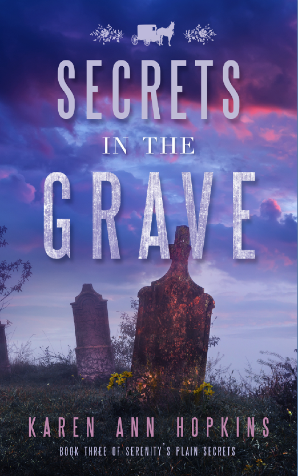
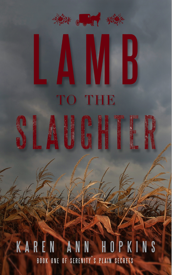
I've had the pleasure of working with Karen Ann Hopkins on all of her indie published books, and I'm so absurdly grateful to her for bringing me such fun and challenging projects. Her Wings of War series and Serenity's Plain Secrets series couldn't be more different in look and feel, so I always enjoy bouncing back and forth between them (Karen writes crazy fast!). The third installment of her Amish murder mystery series is titled Secrets in the Grave, and we kept to the aesthetic established with the previous two books, focusing on an ominous outdoor landscape with lots of color to make sure it stands out online. I hope you guys love this latest installment as much as we do!

SECRETS IN THE GRAVE
Serenity's Plain Secrets #3


Just when Sheriff Serenity Adams thinks life is getting back to normal, the death of a young, pregnant Amish woman rocks the community. Is it circumstance…or murder? It’s up to Serenity and her ex-Amish boyfriend, Daniel Bachman, to discover the truth about the new shaman-type medicine man who’s brought his dark secrets to Blood Rock.

But Serenity has secrets of her own, and if she and Daniel don’t work it out, the reappearance of a woman from his past could threaten to ruin their relationship.

The deeper Serenity delves into the magical world of Amish herbal medicine, the phenomenon of laying of the hands and other cultural healing oddities, the more she wonders if miracles are real. What she witnesses with her own eyes may be too fantastical for her to believe.

In this riveting third installment of Serenity’s Plain Secrets, beliefs are challenged, a way of life is questioned and family skeletons are unearthed, leaving no one untouched.  


WHISPERS FROM THE DEAD
Serenity's Plain Secrets #2


Some Amish communities aren't so cozy.
Whispers From The Dead is the powerful and thrilling sequel to Lamb to the Slaughter, in the Amish mystery series, Serenity’s Plain Secrets.

Sheriff Serenity Adams and Daniel Bachman are once again partnered up in a criminal investigation, when they travel to a northern Amish settlement that has been riddled by arsons for the past two decades. Serenity quickly discovers that there is much more going on than just barns being set on fire in the touristy community, and that the new group of Amish has their own secrets to hide. She begins to unravel an extensive criminal underworld that threatens to destroy everything that the simple people of Poplar Springs hold dear and once again puts her own life in jeopardy.

And even though Serenity tries desperately to avoid it, things begin heating up between her and Daniel, making her wonder if true love and happiness are really within her grasp.


LAMB TO THE SLAUGHTER
Serenity's Plain Secrets #1


Lamb to the Slaughter is a story about the intertwining lives of three unlikely people in an Indiana Amish Community and the devastating results when a rebellious teenage girl is found shot to death in a corn field during the harvest.

Serenity Adams is the newly elected young sheriff in the country town of Blood Rock and besides dealing with the threatening behavior of her predecessor, she now has a dead Amish girl on her plate.  At first glance, the case seems obvious.  The poor girl was probably accidently shot during hunting season, but when the elders of the Amish community and even the girl’s parents react with uncaring subdued behavior, Serenity becomes suspicious.  As she delves deeper into the secretive community that she grew up beside, she discovers a gruesome crime from the past that may very well be related to the Amish girl’s shooting.

Serenity enlists the help of the handsome bad-boy building contractor, Daniel Bachman, who left the Amish when he was nineteen and has his own dark reasons to help the spunky sheriff solve the crime that the family and friends who shunned him are trying desperately to cover up.  Serenity’s persistence leads her to a stunning discovery that not only threatens to destroy her blossoming romance with Daniel, but may even take her life in the end.

GoodreadsAmazonB&N

Find Karen:
 
You can find more of my cover design work at Seedlings Design Studio!

• • • • • • • • • • • 

GIVEAWAY

a Rafflecopter giveaway

Friday, July 24, 2015

Friday Flourish: The Box of Souls

Happy Friday Everyone!

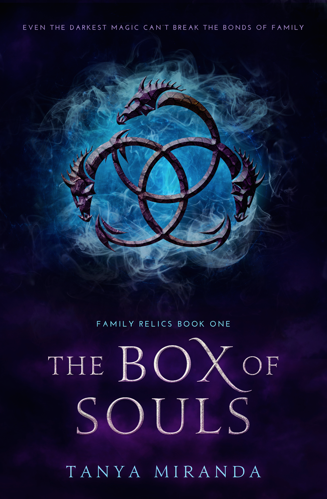
I have one more cover to share with all of you before I take a little break from flourish posts, and I really couldn't be more excited to show you because...DRAGONS. As much as I love reading about dragons, I might love designing with them even more, so when author Tanya Miranda sent in her artwork form my eyes immediately zeroed in on the word dragons and I might have flailed.

Tanya and I went through a few initial comps for The Box of Souls, playing with a scale texture and blending it with imagery of the Golden Gate Bridge to give a sense of place while keeping a dragon symbol as the focal point, but ultimately we decided that simplicity was the way to go. We eliminated both the scale texture and the bridge image, adding a subtle lighting effect to the background but otherwise allowing the triple dragon symbol to speak for itself. We also kept the typeface clean and easy to read, letting it have just a single flourish for personality and movement.

The Box of Souls releases next month, so I hope if you're intrigued you'll add it to your lists!

THE BOX OF SOULS


18-year-old Jasmyn secretly resents her family's preference for her 8-year-old sister Katarina. Her jealousy grows when her grandmother, a dying witch, overlooks Jasmyn and chooses Katarina to inherit her magic powers.  Although being second-place to her sister is something Jasmyn has grown accustomed to, this rejection wounds her like no other.

Little does Jasmyn know, she too has inherited some of her grandmother's powers. Resentment and envy are a dangerous pair, but when doused with magic, the chaos it creates is unimaginable.

AmazonB&NKoboiTunesGoodreads 

You can find more of my cover design work at Seedlings Design Studio!   

Friday, July 17, 2015

Friday Flourish: The Lemorian Crest

Happy Friday Everyone!

It's a cover reveal kind of week this week, so today I'm bringing you (forcing on you?) another cover I've had the pleasure of working on recently. The process of designing the cover for a sequel without having worked on the first book is always a fun challenge for me, the goal to make it stand on its own while still incorporating recognizable elements of the first cover to ensure they have a similar feel.


Uncovering Cobbogoth is the first book in Hannah L. Clark's young adult fantasy series and the foundation off which I needed to base The Lemorian Crest. Both Hannah and I loved the star graphic with the jewels behind the title, so we wanted to make sure the new design had a similar line art element as a focal point. We also wanted to simplify, playing up color and texture as is highlighted on Uncovering Cobbogoth while allowing the title and background graphics to be a bit more easily decipherable. I hope you guys like what we've done with The Lemorian Crest!


After being raised from infancy in Boston, Mass., Noria (a.k.a Norah Lukens) has no idea what to expect upon entering New Cobbogoth, where she never would have guessed that paths of light can make you vanish; doors can lead to realms both near and far; myths and legends are actual history; a mere kiss can seal two souls as one; and, of course, a stone is never “just a stone.” Her Uncle Jack’s stories never could have prepared her for the magical and dangerous place her native realm is turning out to be.

When the Gihara’s promises begin to crumble, her best friend and soul-mate Jamus (a.k.a. James Riley) is in more danger than ever. Then when his father Lylend abandons her to search for an ancient relic called The Lemorian Crest and she is taken captive by the very people she’s risked everything to save, Noria begins to lose faith in the Cobbogothian gods and the mission they sent her home to accomplish.

Only when a series of new friendships and loyalties are forged in the most peculiar of places, does Noria dare hope again. Hope for Jamus’ safety, for their future together, and for the survival of the entire Cobbogothian race.


Find Hannah:


You can find more of my cover design work at Seedlings Design Studio!   

Friday, June 26, 2015

Friday Flourish: Black Heart, Red Ruby

Happy Friday Everyone!

I'm super excited today to share another of my recent cover designs, this one for author Teresa Yea who I had the privilege of working with on Love in a Time of Monsters. Teresa never fails to come to me with a project that makes me positively giddy at the thought of working on it, and given how madly in love I was with the way Monsters came together I couldn't wait to team up with her again on her newest release, Black Heart, Red Ruby.

Black Heart, Red Ruby is contemporary gothic horror, so we originally discussed a design that would be dark in nature–lots of blacks and reds combining to create a bold, heavy look–with the heroine as a focal point. After submitting the first round of idea boards, Teresa and I ended up back at the drawing board, realizing the direction in which we'd been heading just wasn't suiting the story the way we'd hoped.

We came to the conclusion that we needed to simplify, keeping the design very graphic, type-driven, and full of grit and texture. You guys already know how obsessed I am with typography, so I couldn't be happier with how the final design turned out. I hope you all love it and decide to add it to your reading lists!

BLACK HEART, RED RUBY
(releases June 30th)


Ava Nolan grew up in the shadow of her father's obsession with macabre artifacts. An elixir brewed from witches’ blood. A cabinet of mummified cats. And Arabella's Curse, the missing prize in his collection: a ruby with the power to resurrect the dead. With a father who resents her existence, a dead-end job, and her expulsion from school to live down, Ava sets out to recover the ruby and reclaim her self-respect. Luckily for Ava, local legend says the ruby is buried in a crumbling mansion by the sea, not far from her new home.

But life as an amateur relic hunter is not without its share of emergency room visits. Or cutthroat competitors. And nearly plummeting to her death doesn’t terrify Ava half as much as her uncle, a gentleman grave robber with a vendetta against her father and sinister plans for the ruby.

Entangled in a web of family treachery, Ava finds solace with a lonely boy who fills her nights with stolen kisses and her head with ruby lore. But there's something strange about Ben Wolcott. He's a bit too cunning, a bit too preoccupied with keeping Ava out of his basement, and much too interested in Arabella's Curse.
Find Black Heart, Red Ruby:


Find Teresa:


You can find more of my cover design work at Seedlings Design Studio!   

Friday, April 17, 2015

Friday Flourish: The Forgotten Web

Happy Friday Everyone!

I don't know about all of you, but I'm very ready for the weekend. Also a vacation:) Before I get to enjoy some much-needed time off though, I'm excited to share with all of you another of my recent cover designs!

While I thoroughly enjoyed my ten years as a wedding stationer, the designs after a while became something I could produce by rote simply due to the fact that though the brides' tastes varied, overall the final pieces still needed to look like wedding invitations. What I love so much about cover design work is the utterly unique challenge each and every project presents, and when author Sara C. Snider came to me with a description of The Forgotten Web I may or may not have done an embarrassing happy-designer dance.

There were so many elements to Sara's story we could have chosen to highlight on the cover, but what immediately took form in my head after reading her design memo was a single feather interlaced with spiderwebs, and after only a few changes it became the final cover. While the web makes obvious sense given the title, you'll just have to read to find out the significance of the feather ;-) Hope you like it as much as we do!

THE FORGOTTEN WEB


Robin's simple life is changed forever when a young Weaver named Fauwen accidentally unravels his existence and traps him in her own strange world. Refusing to accept his disastrous fate, Robin convinces Fauwen to use blood magic to weave his life anew.

But that which is unwoven can never be redone, and a life borne of blood carries a terrible price. Robin returns to a darkened world where shifting memories and tenuous realities threaten to tear apart the fabric of his sanity.

Find Sara & The Forgotten Web:


You can find more of my cover design work at Seedlings Design Studio!