Welcome to my stop on The Lovely Reckless Blog Tour! Author Kami Garcia was so nice as to ask all participating bloggers what type of content they'd most like to feature, and since cover design is such a point of interest for me (and I know so many of you as well), I asked if it would be possible to ask the designer a few questions. To my delight, Natalie C. Sousa, Creative Director at Imprint (Macmillan) and the cover designer for The Lovely Reckless, agreed to an interview and let me pick her brain about her overall process. I hope you guys enjoy!
How does a cover design typically start for you? Do you begin with sketches? Idea boards?
Natalie Sousa: I start by sketching concepts as thumbnails, and take it in stages. Usually I begin just after reading a summary. This puts me in the same mental space a consumer might approach the book from. I sketch some more ideas half way through reading the manuscript, and again once I've processed the ending. There have been times where the ending really changed the way I felt about a story, and I like to capture all of those reactions.
With The Lovely Reckless, did you have a specific concept or concepts going in? And if so, how did those change as you started designing?
Natalie: Erin Stein, the publisher of Imprint started the process with Kami before I was hired. They knew exactly the energy and style they wanted to convey from the very beginning. I love when designs work out to follow someone's original vision. When I started at Imprint this cover was in its sketch stage. From there we were playing with the chemistry between the couple and deciding what, if any, other elements would help to tell more about the book.
What stage of the design process is typically the most challenging for you (deciding on a design direction, image or font selection, first comps, revisions, etc.)?
Natalie: It used to be deciding on a direction, because what I visualize, or an editor envisions, or an author wishes, and a sales team needs for a cover are usually different. Erin and I have developed a close working relationship, and we're always talking about our books. That kind of dialogue helps me have very clear direction.
If you could tweak any one of your already published covers, which would you most like to get your hands on one more time?
Natalie: Recently I got to chat with Brenna Yovanoff and told her how I'd love to go back and place a hand rising from the baby carriage on her book, The Replacements. Although that cover is probably creepy enough as is!
Can you share a couple early versions of The Lovely Reckless and tell us what about them worked or didn’t work?
Natalie: Here is an early sketch from Loui Jover, the artist. We were missing some chemistry in this earlier sketch. Showing the characters full length helped because the body language said a lot more.
This is an early cover comp from Liz Casal, an incredibly talented designer. She had a clever solution to indicating the car by lighting the brick wall with “headlights”. That element was dropped because it didn’t quite work with the final color palette and title design.
QUICKFIRE QUESTIONS
Favorite font?
Font you wish you’d never have to see again?
Favorite cover you’ve done?
It does not exist yet.
All-time favorite cover?
A Wrinkle In Time
Cover designer who inspires you?
There are many, but Kristin Smith, an Art Director at Penguin, inspires me with her designs and her friendship! Back in our shared Penguin days we used to make elaborate costumes for Halloween and Coney Island's Mermaid Parade together. Kristin always inspired me to get into the details of a costume. Her book design for Danielle Vega's The Merciless is also one of my all time favorite book designs! I cannot resist a hot pink bible.
Favorite color?
My preference often changes, so I’ll say it’s the rainbow.
Must have when designing (food, music, etc.)?
Definitely music! I like to create playlists inspired by the stories I'm designing for. My favorite so far has been for Marcie Colleen's Super Happy Party Bears. Kami Garcia's next book is already inspiring a playlist; first couple songs on there have been Special by Garbage and Bulletproof by La Roux.
If you weren’t a designer you would be . . .?
Here’s my "card".
Number of projects you’re currently working on?
More than I have fingers and toes.
Next cover of yours you’re most excited to reveal?
Blind Item by Kevin Dickson and Jack Ketsoyan. Kevin and Jack are two Hollywood insiders writing a fictional tale with real-life scandals! It’s a super fun read. I got a really strong reaction to the cover from the Macmillan team and I'm curious to see how the public responds.


Thank you so much Natalie!
• • • • • • • • • • • • • • • • •
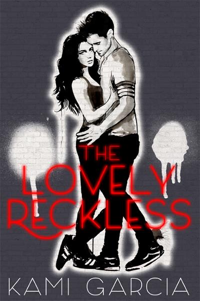
THE LOVELY RECKLESS

From #1 New York Times bestselling author Kami Garcia, a contemporary romance full of loss, love and redemption…
Seventeen year-old Frankie Devereux would do anything to forget the past. Haunted by the memory of her boyfriend’s death, she lives her life by one dangerous rule: nothing matters. At least, that’s what Frankie tells herself after a reckless mistake forces her to leave her privileged life in the Heights to move in with her dad―an undercover cop. She transfers to public school in the Downs, where fistfights in the halls don’t faze anyone and illegal street racing is more popular than football.
Marco Leone is the fastest street racer in the Downs. Tough, sexy, and hypnotic, he makes it impossible for Frankie to ignore him . . . and how he makes her feel. But the risks Marco takes for his family could have devastating consequences for them both. When Frankie discovers his secret, she has to make a choice. Will she let the pain of the past determine her future? Or will she risk what little she has left to follow her heart?
Your own heart will race with each page turn of this heart-stopping star-crossed love story.
• • • • • • • • • • • • • • • • • • • •
KAMI GARCIA

Photo Credit: Vania Stoyanva
Kami Garcia is the #1 New York Times, USA Today & international bestselling coauthor of the Beautiful Creatures and Dangerous Creatures novels. Kami’s solo series, The Legion, includes the instant New York Times bestseller UNBREAKABLE, and the sequel UNMARKED. Her forthcoming YA contemporary romance THE LOVELY RECKLESS releases on October 4, 2016, followed by THE X-FILESORIGINS: AGENT OF CHAOS, a novel about a teenage Fox Mulder, in January 2017, both from Imprint (Macmillan).
Kami was a teacher for seventeen years before co-authoring her first novel on a dare from seven of her students. If she isn’t busy watching Supernatural, Kami can teach you how to escape from a pair of handcuffs or bake a Coca-Cola cake. She lives in Maryland with her family, and their dogs Spike and Oz (named after characters from Buffy the Vampire Slayer). Visit Kami at www.KamiGarcia.com and on Twitter and Instagram @kamigarcia.
Kami was a teacher for seventeen years before co-authoring her first novel on a dare from seven of her students. If she isn’t busy watching Supernatural, Kami can teach you how to escape from a pair of handcuffs or bake a Coca-Cola cake. She lives in Maryland with her family, and their dogs Spike and Oz (named after characters from Buffy the Vampire Slayer). Visit Kami at www.KamiGarcia.com and on Twitter and Instagram @kamigarcia.