Hi Everyone!
Some of you might remember a post I did a couple months ago where I walked through the
cover design process for City of Fae, and since that seemed to be something everyone enjoyed seeing, I thought I would make it a semi-regular feature here on the blog :)
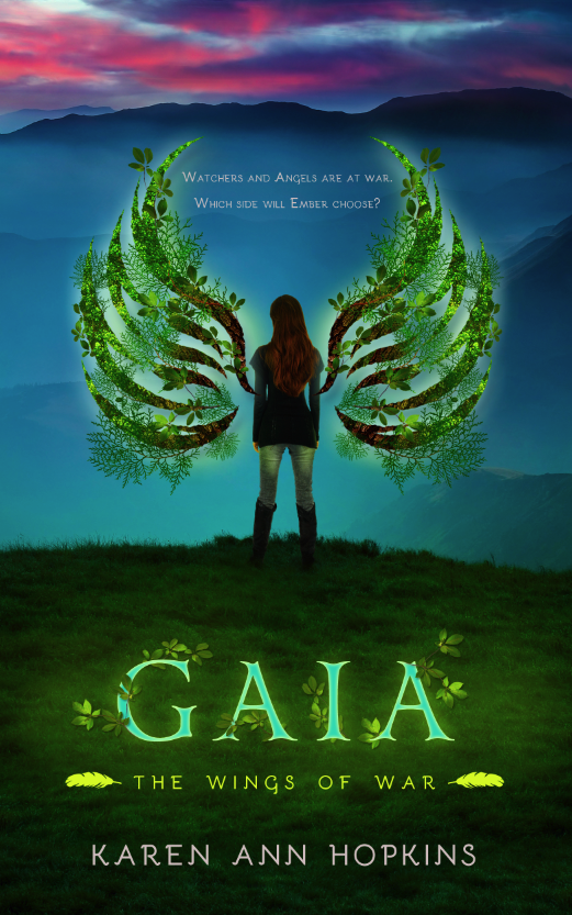
Today I'm sharing the cover evolution for
Gaia, the newest installment of the Wings of War series by
Karen Ann Hopkins. This series is always a trickier one for me in terms of the technical aspect of the design, as my background is heavily InDesign-based–my comfort zone being flat graphic illustrations and typography–so covers that require a lot of Photoshop manipulation are more intimidating for me from the start. There's nothing I love more than a challenge though, and I've had such fun bringing
Embers and
Gaia to life!
Karen wanted a more epic feel to
Gaia, moving Ember out of the woods of the first installment and putting her in a more sprawling landscape that really spoke to the scope of the book. Here is the original, raw image.
Given this book focused on Ember's exploration of the earth element, Karen wanted it to be bright and vibrant with a bold use of color, so I think she was probably somewhat concerned when I told her I thought this image would work best from the initial group I sent her. The color is obviously drab and dull, but I thought it gave us the epic feel she was looking for, and it would allow for Ember to quite literally be standing on a precipice. We just needed a little color:
Color is one of the easier adjustments to make in Photoshop, so I added a series of layers to give the cover the vibrancy we wanted while ensuring it had an ominous quality as well since things get darker for Ember throughout the book.
The next step was to add Ember herself to the image, and it was by far the most challenging aspect of this design. The primary concern for me when compositing images together is lighting. The image we're taking the figure from (the source image) needs to match the image we're moving it to (the destination image) in terms of lighting or it's going to look digitally manipulated in the worst possible way.
I like to stick to studio shots of people rather than environmental shots when doing a more realistic composite, as the lighting is usually even overall instead of coming from one specific direction and creating harsh highlights or shadows. Since my background image above has a very muted quality–no sun to create directional shadows–the even tone of a studio shot is ideal (but not perfect, as you'll see below).
Here's the raw image of Ember:
While she looks great against the white, when I cut her out and added her to my existing background, you can see a number of problems arose:
She couldn't look less like she belongs in this environment, and instead is simply floating above the grass looking ridiculously out of place. In order to make the composition more seamless, I darkened her figure, added a shadow underneath her, and took some of the blades of grass and laid them over the heels of her boots so she would appear as though she was actually a part of the landscape around her. I also added some green highlights to her so she would look like she was lit by the glow of the wings when those came into play next.
The final step before adding the copy was to give her wings. As mentioned in the
cover reveal, Ember explores her ability to control a different element in each book, so I wanted the wings to reflect the specific element central to each installment. I started with just a flat illustration of the wings that I'd drawn in InDesign:
Since
Gaia sees Ember learning to harness the Earth element, I wanted to build the wings out of various leaves and branches and really make them a focal point. I started with a couple leaf and bark textures as a foundation, and then threaded 3 different types of branches in and through the illustration before finishing with a subtle glow around both wings.
So close! The last step was to add one last layer of color as well as the title, series title, Karen's name and the tagline, and then we had our finished cover: