Hey Everyone!
Some of you may remember a little while back I posted about a new cover design contest held by the team at Spencer Hill Press for
Damsel Distressed by Kelsey Macke, one of their 2014 releases. I've entered several design contests in the past, and while there have been some truly amazing prizes that made the fangirl in me do an absurd happy dance through my living room, this contest is a little different. The winner of this contest actually wins the design commission, meaning their design will be the final cover of the book. *Jenny falls down dead*
I've been a graphic designer for going on ten years, but up until now majority of my work has been in the
wedding stationery industry. While I've loved working with brides, this past year I've been craving a new challenge, and so I've begun to dip my toes into the world of book cover design. I have high hopes for this new business venture moving forward (though mixed in with all my excitement is no shortage of nerves), which is why this contest is such a fantastic opportunity for me to get a foot in the door.
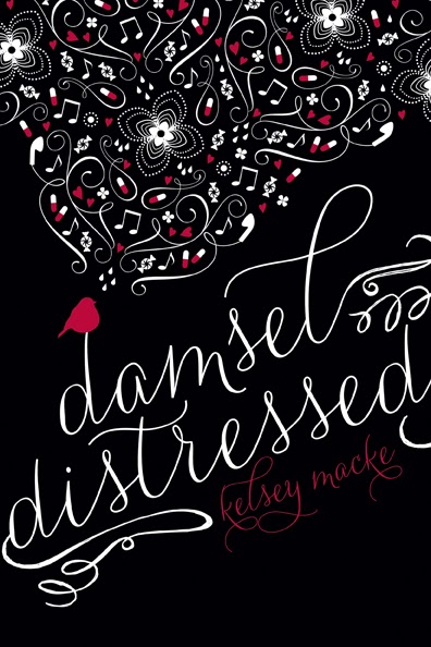
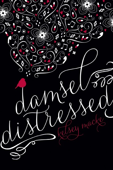
I submitted four designs overall, and was lucky enough to have two of my entries make it to the top ten. Now that a top ten has been chosen, a public poll is open so people can vote for their favorites, with the winner automatically making it through to the final three. Below are my two submissions, nicknamed "Moody Masks" and "Black Bird" by the
Damsel Distressed team. There are some truly amazing entries submitted by a variety of designers and illustrators, and you can vote for your favorites by following the link below. You can only vote for one at a time, but you can vote as often as you'd like, so technically you could vote for all ten if you wanted. If mine are among your favorites, I'd so appreciate your vote, but I'm in outstanding company so I encourage any of you who are interested to check them all out!
"MOODY MASKS"
Damsel Distressed is going to be a unique book in terms of format, with doodles and journal entries belonging to heroine Imogen scattered throughout the book. As a result, I wanted the cover to have a doodle or hand-drawn quality to it, hence the different flourishes and florals top and bottom.
Like so many people, Imogen has her day to day struggles which include pills and cutting, so I wanted to make sure there was an obvious contrast to the cover to highlight all the different elements that make up Imogen's life. The top half features warm, happy colors with things like earbuds, candy, and movie tickets appearing alongside the doodles to represent Imogen in her better moments, while the bottom half focuses on cooler colors and incorporates sharper objects like razor blades and safety pins, as well as tears and pills, to indicate her darker moments.
Imogen is also very involved in the theater, so I thought the very recognizable theater masks would be a perfect fit both literally and figuratively.
"BLACK BIRD"
With this second design, I wanted the overall look to be similar in its emphasis on doodles and handwritten fonts, but I went with a far bolder color scheme to kick the drama up a few notches and make sure it would pop online or on a shelf.
In addition to the doodles and journal entries, this book also has a huge focus on music, which was the main inspiration for the bird and its beautiful yet jumbled song made up of the highs and lows of Imogen's life.
• • • • • • • • • •
Voting will run through October 31st, after which time the final three will be announced. I'm really proud of how my two entries turned out, and am so honored to be in the top ten. If you get a chance to vote, that would be amazing, but if not, I'd just love to hear what you think about the designs in the comments!