

I'm excited to welcome young adult author Andrea Colt to the blog today to share with us the various changes the cover for her newest release, Wavecrossed, went through before it was exactly what she wanted. I think anyone who reads this blog knows there's nothing I love more than a well-designed cover (except for maybe a swoon-worthy fictional boy, but I digress), so seeing the little tweaks made to a cover during the design process is nothing short of fascinating for me. I hope you all enjoy it as well!
COVER PROGRESSION
I am blessed with an extremely talented artist sister. She started out working in clay, progressed to awesome mosaics, and also got into digital art a few years ago. Although I made most of the cover for Torched (my sister did the flame, which was way outside my limited sphere of capability), I knew that what I wanted for Wavecrossed was way more complicated.
The concept started out as a water-evoking background, with hand-lettered text for the title and swooping accents. I also wanted to work in an element from Wavecrossed: a golden starfish pendant. And I wanted a silhouette of a seal, to show that it featured selkies.
This was the rough draft:

That baby seal is SOOO CUTE, right? I loved it, but the very cuteness of the seal made the book feel like a kid’s story. So I asked her to age it up a bit, along with some other changes: making the starfish gold so it popped, darkening the blue, a different font for my name.
Here’s the second draft:
I loved that seal silhouette even more, but though it was awesome, having an animal on the cover still made the book feel like a children’s novel. So we decided to try taking out the seal entirely (picture me very sad about this):

She also simplified some of the swirliness, which had gotten in the way of clarity when people read the title, and moved the whole image down a bit for balance now that the seal was gone, and darkened the blues a bit.
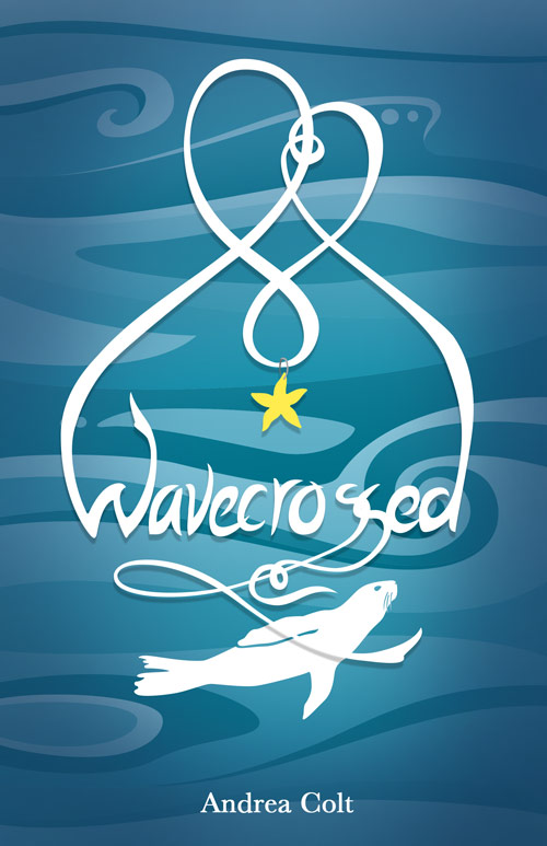
After that, all I had to do was tweak the author name font, add a lovely blurb courtesy of author Lindsay Smith, and I had this lovely cover:

Voila! I think I’m going to order a print of the cover and frame it, I love it so much.
Thanks for reading about Wavecrossed’s cover progression! If you want to find out more about the book behind the awesome cover, here’s the summary:
To Cassandra Kelleher, trust is a dirty word.
A teenage selkie who grew up on land, all she wants is to free her family from the man who stole their sealskins long ago. With her twin brother Brennan losing hope and her window of opportunity disappearing like the beach at high tide, she’ll try anything.
Before long, however, Cassandra can’t tell whether her biggest threat is the man holding her family captive, a classmate who’s discovered her secret, or her own paranoia. Battling broken friendships and alarming romantic entanglements, Cassandra finds that trust could be the key to winning her family’s freedom … or losing her own.
• • • • • • • • • •
ANDREA COLT

Andrea Colt grew up reading and squabbling with her identical twin. She lives in Alexandria, Virginia with her husband, a fridge full of cheese, and two feline muses. Visit andreacolt.com to get to know her better.
I loooove Andrea Colt - her YA Contemporary Torched was made of awesome!! The cover from Watercrossed looks insanely pretty and I am looking forward reading it myself!
ReplyDeleteSeal gone, much better. It did feel more kiddie like. I like the swirly things
ReplyDeleteI really love this post. The cover is so pretty and I agree it was a good decision to remove the seal. This is my fave shade of blue. Great post Jenny :)
ReplyDeleteOoh, I love this post! It's always interesting to see how a cover gets made and this one is beautiful! Thanks for sharing, Jenny!(:
ReplyDeleteThat's a gorgeous and very professional-looking cover -- you've got a very talented sister, indeed. I love how the blue and the title font swirl like the ocean and, though the seal was adorable, it was a good choice to remove it.
ReplyDeleteIt is amazing how much we are alike Jenny! ;)
ReplyDeleteIt is fun too see how many changes covers go through before the perfect one is found and amazing what the smallest of difference can make on them.
What a fun post!
You're so lucky that you have such a talented sister Andrea, she has done an amazing job with this cover, I love that you shared your progression to your final cover with us today, I think it's a pretty cool cover! And that baby seal was super cute!
ReplyDeleteI have heard and seen this book around a lot. It looks awesome. I love the cover. My hubby is to a graphic designer but I have to nag him to make me something cause he is always so busy. LOL
ReplyDeleteI love seeing the cover process unfold like this! I'm like you, a good cover is one of my favorite things (besides the whole smokin hot hero thing) about books. Thanks for sharing! :-)
ReplyDeleteI love seeing the progress of the cover. It's fascinating, and I love how your sister worked so well with you to help you get the cover you love so much! Thanks for sharing that with us!
ReplyDeleteLaureen @ Ms. Bibliophile.
I love the seal too, but I can see what you mean. I really love the way it turned out. Thanks for letting us in on the progression!
ReplyDeleteSuch a cool post! Thanks for sharing the progression. It's art at work.
ReplyDeleteI love it! I love the simplicity of both her covers and like that they are different. I think they look professional and appreciate that there's not just another person on a cover. I like the different look a lot. And I loved getting the story about the cover progression! I read the book and loved it and I think the cover matches it very well!
ReplyDelete