
Some of you might remember a post I did a couple months ago where I walked through the cover design process for City of Fae, and since that seemed to be something everyone enjoyed seeing, I thought I would make it a semi-regular feature here on the blog :)
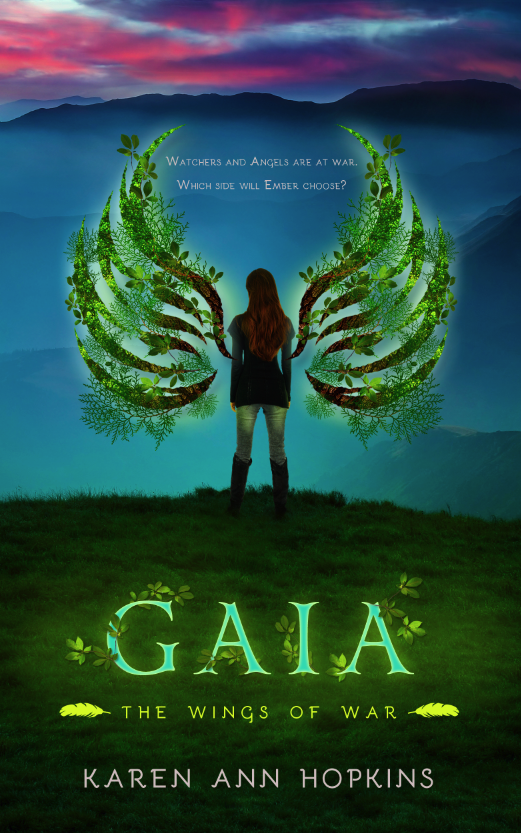
Today I'm sharing the cover evolution for Gaia, the newest installment of the Wings of War series by Karen Ann Hopkins. This series is always a trickier one for me in terms of the technical aspect of the design, as my background is heavily InDesign-based–my comfort zone being flat graphic illustrations and typography–so covers that require a lot of Photoshop manipulation are more intimidating for me from the start. There's nothing I love more than a challenge though, and I've had such fun bringing Embers and Gaia to life!
Karen wanted a more epic feel to Gaia, moving Ember out of the woods of the first installment and putting her in a more sprawling landscape that really spoke to the scope of the book. Here is the original, raw image.

Given this book focused on Ember's exploration of the earth element, Karen wanted it to be bright and vibrant with a bold use of color, so I think she was probably somewhat concerned when I told her I thought this image would work best from the initial group I sent her. The color is obviously drab and dull, but I thought it gave us the epic feel she was looking for, and it would allow for Ember to quite literally be standing on a precipice. We just needed a little color:

Color is one of the easier adjustments to make in Photoshop, so I added a series of layers to give the cover the vibrancy we wanted while ensuring it had an ominous quality as well since things get darker for Ember throughout the book.
The next step was to add Ember herself to the image, and it was by far the most challenging aspect of this design. The primary concern for me when compositing images together is lighting. The image we're taking the figure from (the source image) needs to match the image we're moving it to (the destination image) in terms of lighting or it's going to look digitally manipulated in the worst possible way.
I like to stick to studio shots of people rather than environmental shots when doing a more realistic composite, as the lighting is usually even overall instead of coming from one specific direction and creating harsh highlights or shadows. Since my background image above has a very muted quality–no sun to create directional shadows–the even tone of a studio shot is ideal (but not perfect, as you'll see below).
Here's the raw image of Ember:

While she looks great against the white, when I cut her out and added her to my existing background, you can see a number of problems arose:

She couldn't look less like she belongs in this environment, and instead is simply floating above the grass looking ridiculously out of place. In order to make the composition more seamless, I darkened her figure, added a shadow underneath her, and took some of the blades of grass and laid them over the heels of her boots so she would appear as though she was actually a part of the landscape around her. I also added some green highlights to her so she would look like she was lit by the glow of the wings when those came into play next.

The final step before adding the copy was to give her wings. As mentioned in the cover reveal, Ember explores her ability to control a different element in each book, so I wanted the wings to reflect the specific element central to each installment. I started with just a flat illustration of the wings that I'd drawn in InDesign:

Since Gaia sees Ember learning to harness the Earth element, I wanted to build the wings out of various leaves and branches and really make them a focal point. I started with a couple leaf and bark textures as a foundation, and then threaded 3 different types of branches in and through the illustration before finishing with a subtle glow around both wings.

So close! The last step was to add one last layer of color as well as the title, series title, Karen's name and the tagline, and then we had our finished cover:
JENNY ahh I love these posts. You are seriously so talented! So fun to see the transitions from the first to last stage. Love it!
ReplyDeleteIt's impressive to see al the progress! You do an amazing work each time!
ReplyDeleteAhh, you made her shoes be covered with grass and then it looked like she actually stood there
ReplyDeleteWow- it's so interesting to see what goes into each book cover. You did an incredible job, Jenny!
ReplyDeleteWow, such a different between just sticking a character in a background and really working well on making it seem like it IS there!
ReplyDeleteI really love these posts Jenny, thank you for sharing them!
Fascinating to read and see the evolutionary process to make this cover design - it's absolutely an awesome cover and very, very creative!!!!!
ReplyDeletePam
It's so cool to see how the covers evolve -- and what you start off with! You're amazing, Jenny! :)
ReplyDeleteI didn't see your other post before but I have to say I really have enjoyed his one. Seeing you design process. I do something similar myself with when design graphics. Love it! :)
ReplyDeleteI love these posts and hope to see more in the future, Jenny!
ReplyDeleteAmazing! I was surprised to see the girl and thought this won't go with this cover at all, but wow! She blends perfectly to the background with all your adjustments.
ReplyDeleteThanks for sharing, Jenny! You're so talented.
Gorgeous and thanks for walking thru this process. You have a great gift and talent!
ReplyDeleteI love when you share the process...it is so cool and I love the cover!!
ReplyDeleteYay! This was so much fun and oh my heck! Gorgeousness Jenny! I loved seeing how you created and designed this, amazing!
ReplyDeleteThis is so much fun! I love seeing these posts...you are so talented!
ReplyDeleteI love these! I'm not talented in design and always wonder how things come together and wow, you are SO GOOD! Thanks so much for sharing with us!
ReplyDeleteI'm a huge fan of angels books. I'm just wondering why I haven't tried reading these yet. Seriously, what's up with that?
ReplyDeleteGorgeous, beautiful, spot-on. As usual. <3
Woah, that was so cool! It's really neat to see how many steps go into making a cover but also how your vision comes to fruition. Thanks for sharing this with us, Jenny! :)
ReplyDeleteI can't imagine doing something like this, Jenny! I just don't have it in me. I suspect I'm a bit color blind, too. But I do appreciate beauty when I see it and that end result is gorgeous. Brava! :)
ReplyDeleteThis is such a cool post! Loved seeing the whole process. It's stunning! You have such a gift. :D
ReplyDeleteJENNY!! YOU ARE AMAZING! I am in awe of your skills and your eye for design! I loved the last post you did like this so I was pumped when I saw you had another one for us. Taking us through your step-by-step process is a real treat, I'm (obviously) amazing at how you transformed the first image into the last, step by step. YOU.ROCK.
ReplyDeleteLove these posts, Jenny! Your thought process is so fascinating and it seems as if you are right next me creating this cover. So cool!
ReplyDeleteI love you doing this kind of post! I'm always interested in how artists work. You do such amazing work!
ReplyDeleteSo effing cool, Jenny! Thanks for sharing your process. :-)
ReplyDeleteThat's freaking cool, Jenny. I love seeing how drastically it changed from point A to the last step.
ReplyDeleteWhoa! I love this Jenny, thanks for sharing. I love seeing your vision, and the end product is BEAUTIFUL.
ReplyDeleteLOVE this feature and I hope to see more! Great job with the cover!
ReplyDelete